Tổng hợp 10+ bài mẫu IELTS Writing Task 1 Line Graph hay
Dưới đây là tổng hợp 10 bài mẫu IELTS Writing Task 1 Line Graph theo các dạng biểu đồ đường từ phổ biến 3 line đến 5 line.
Trước khi đến với bài mẫu, chúng ta cùng điểm qua về cách phân tích và viết dạng bài Line Graph để nắm rõ hướng viết bài tốt hơn nhé.
Cách viết Line Graph như thế nào?
Biểu đồ đường sẽ có ít nhất 2 đường và có thể đề ra đến 5-6 đường. Các đường sẽ thể hiện sự thay đổi của một yếu tố nào đó qua nhiều mốc trong một khoảng thời gian nhất định. Mỗi đường sẽ thể hiện một đối tượng với các xu hướng thay đổi, thường là theo thời gian.
Để viết bài Line Graph, thí sinh cần sử dụng các từ vựng, cấu trúc miêu tả sự thay đổi khác nhau, phân tích để tìm ra các điểm nổi bật và viết vào bài.
Cấu trúc viết bài Line Graph là:
- Introduction: 1 sentence. Ở mở đầu bạn có thể paraphrase lại câu hỏi
- Overview: 1-2 sentences. Phần này nêu tổng quan, phân tích chung overview
- Body paragraph 1: 3-4 sentences. Ở body, thực hiện phân tích report data, describe trends/changes, make comparisons
- Body paragraph 2: 3-4 sentences. Tương tự thực hiện phân tích report data, describe trends/changes, make comparisons
- Conclusion (nếu muốn): 1 sentence. Viết câu kết luận, tổng kết.
Bài phân tích chi tiết thì IELTS Fighter đã chia sẻ ở bài trước, bạn click đọc ở bài này có kèm video giới thiệu nhé: IELTS Writing Task 1: Luyện tập cách viết dạng Line Graph
Dưới đây là bài mẫu để bạn mở rộng vốn từ và hiểu hơn cách viết, ý tưởng, phân tích hiệu quả.
10+ bài mẫu Task 1 Line Graph
Các bài mẫu Line Graph tổng hợp dưới đây đi theo cấu trúc bao gồm:
- Đề bài chi tiết
- Outline viết bài gợi ý theo tiếng Anh - Việt
- Bài mẫu Anh - Việt tham khảo
- Từ vựng nổi bật để lưu sử dụng sau
Nào bây giờ bắt đầu đọc bài mẫu tham khảo nhé.
Bài mẫu 1
Đề bài:
The line graph shows the number of international tourists visiting three different countries from 2000 to 2020.
Summarise the information by selecting and reporting the main features, and make comparisons where relevant.
Outline (English)
|
Introduction Mở bài |
The line graph illustrates the number of international tourists (in millions) visiting three different countries from 2000 to 2020. Biểu đồ đường minh họa số lượng khách du lịch quốc tế (tính bằng triệu người) đến ba quốc gia khác nhau từ năm 2000 đến 2020. |
|
Overview Tổng quan |
Tourist numbers in all three countries increased over the period. Số lượng khách du lịch đến cả ba quốc gia đều tăng trong suốt giai đoạn này. |
|
Body Paragraph 1 Thân bài 1 |
Describe the trends in Country A, which had the highest figures, and Country B, which showed a consistent increase. Mô tả xu hướng của Quốc gia A, nơi có số lượng khách du lịch cao nhất, và Quốc gia B, nơi có mức tăng trưởng ổn định. |
|
Body Paragraph 2 Thân bài 2 |
Explain the trends in Country C, which had the lowest number of tourists but saw continuous growth. Giải thích xu hướng của Quốc gia C, nơi có số lượng khách du lịch thấp nhất nhưng vẫn duy trì sự tăng trưởng liên tục. |
Sample Essay
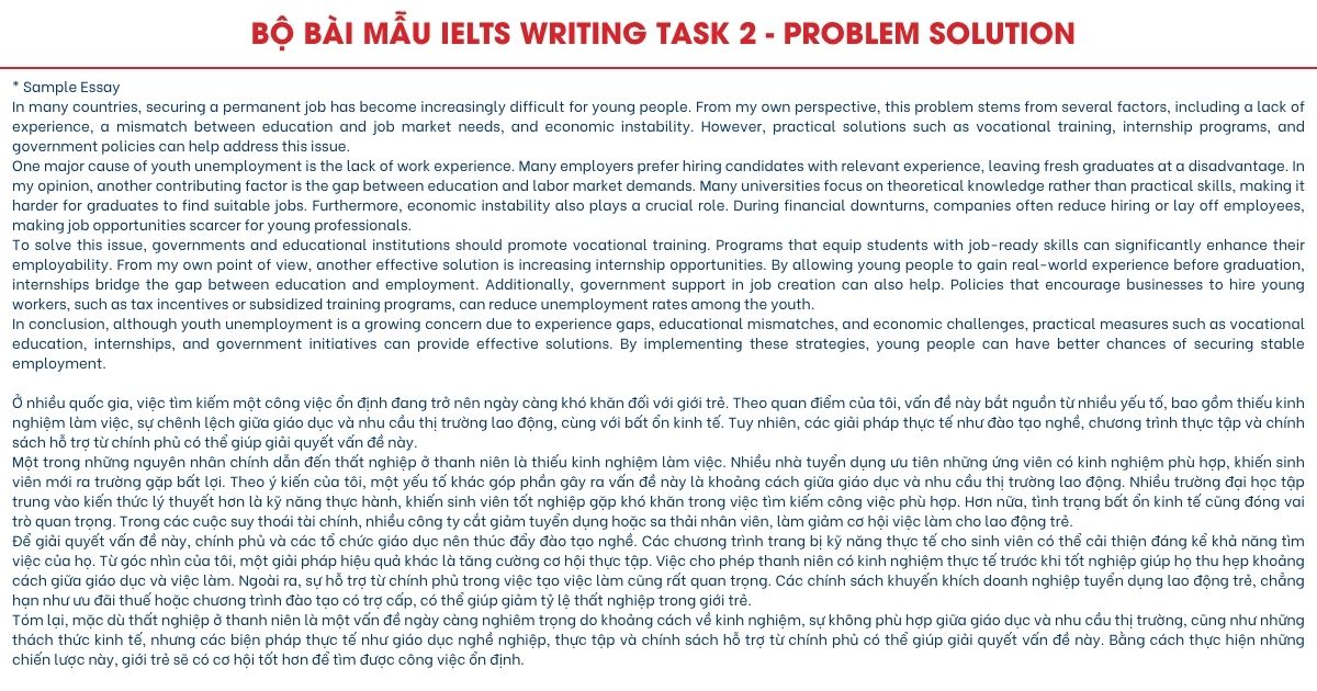
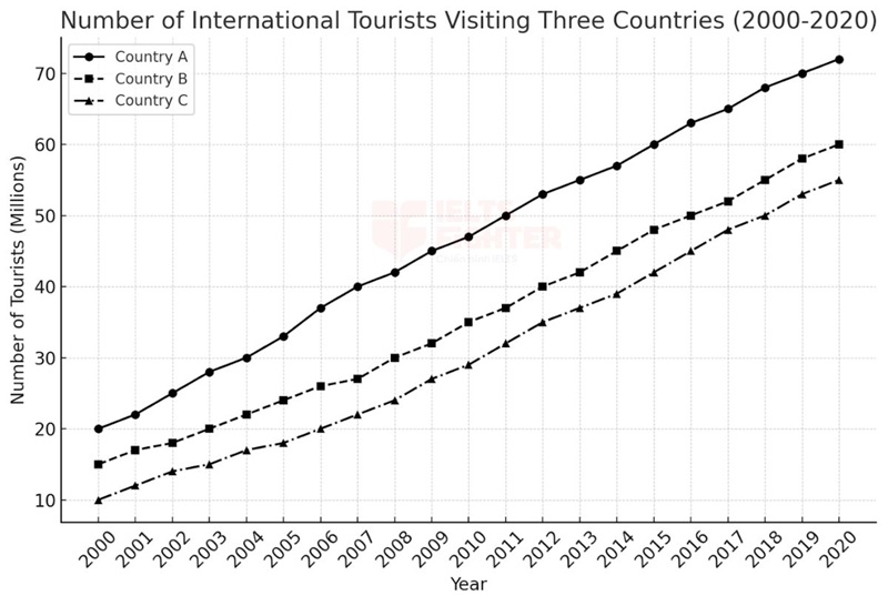
The line graph illustrates the number of international tourists visiting three different countries between 2000 and 2020.
Overall, the number of visitors to all three countries increased significantly over the period. Country A consistently attracted the highest number of tourists, while Country C had the lowest but showed steady growth.
In 2000, around 20 million tourists visited Country A, and this figure gradually rose to 72 million by 2020. Country B had 15 million visitors at the beginning of the period, and the number increased steadily to reach 60 million by the end. The growth rate of Country B was slower compared to Country A but remained consistent.
Meanwhile, Country C started with the lowest number of tourists, at just 10 million in 2000. However, the figure doubled to 20 million by 2010 and continued to grow steadily, reaching 55 million by 2020. This suggests that although Country C lagged behind in the early years, it experienced significant growth and nearly caught up with Country B by the end of the period.
Biểu đồ đường minh họa số lượng khách du lịch quốc tế đến ba quốc gia khác nhau trong giai đoạn từ năm 2000 đến 2020.
Nhìn chung, số lượng khách du lịch đến cả ba quốc gia đều tăng đáng kể trong suốt khoảng thời gian này. Quốc gia A luôn thu hút số lượng khách cao nhất, trong khi Quốc gia C có số du khách thấp nhất nhưng tăng trưởng đều đặn.
Năm 2000, khoảng 20 triệu khách du lịch đã đến Quốc gia A, và con số này tăng dần lên 72 triệu vào năm 2020. Trong khi đó, Quốc gia B bắt đầu với 15 triệu lượt khách và tăng đều đặn lên 60 triệu vào cuối giai đoạn. Tốc độ tăng trưởng của Quốc gia B chậm hơn so với Quốc gia A nhưng vẫn duy trì ổn định.
Trong khi đó, Quốc gia C có số lượng khách du lịch thấp nhất vào năm 2000, chỉ đạt 10 triệu. Tuy nhiên, con số này đã tăng gấp đôi lên 20 triệu vào năm 2010 và tiếp tục tăng đều đặn, đạt 55 triệu vào năm 2020. Điều này cho thấy mặc dù Quốc gia C có lượng khách thấp nhất vào những năm đầu, nhưng tốc độ tăng trưởng mạnh mẽ đã giúp nước này gần bắt kịp Quốc gia B vào cuối giai đoạn.
Uncommon Words and Collocations
- International tourists(/ˌɪntərˈnæʃənəl ˈtʊərɪsts/, noun phrase): Khách du lịch quốc tế
- Steady growth(/ˈstɛdi ɡroʊθ/, noun phrase): Sự tăng trưởng ổn định
- Consistently attract(/kənˈsɪstəntli əˈtrækt/, verb phrase): Luôn thu hút
- Gradually rise(/ˈɡrædʒuəli raɪz/, verb phrase): Tăng dần
- Lag behind(/læɡ bɪˈhaɪnd/, verb phrase): Bị tụt lại phía sau
Bài mẫu 2
Đề bài:
The line graph shows the percentage of people using four different modes of transport in a city from 2000 to 2020.
Summarise the information by selecting and reporting the main features, and make comparisons where relevant.
Outline
| Introduction |
The line graph illustrates the percentage of people using four different modes of transport—cars, buses, bicycles, and walking—in a city from 2000 to 2020. Biểu đồ đường minh họa tỷ lệ người sử dụng bốn phương thức giao thông—ô tô, xe buýt, xe đạp và đi bộ—tại một thành phố từ năm 2000 đến 2020. |
| Overview |
Car usage experienced a steady decline, while public transport and cycling became more popular. Tỷ lệ sử dụng ô tô giảm dần theo thời gian, trong khi phương tiện công cộng và xe đạp ngày càng trở nên phổ biến hơn. |
| Body Paragraph 1 |
Discuss the decline in car and walking usage. Thảo luận về sự suy giảm của ô tô và đi bộ. |
| Body Paragraph 2 |
Explain the increase in bus and bicycle usage over time. Giải thích sự gia tăng của xe buýt và xe đạp theo thời gian. |
Sample Essay
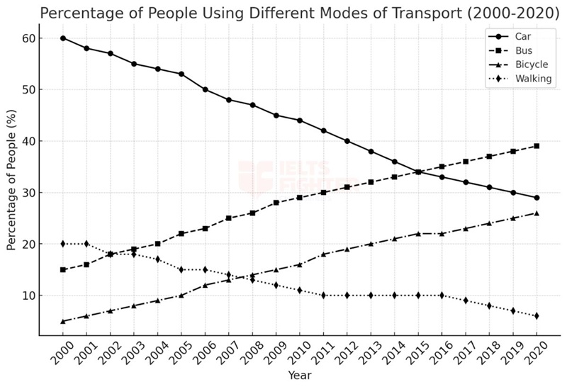
The line graph illustrates the percentage of people using four different transport modes—cars, buses, bicycles, and walking—in a city between 2000 and 2020.
Overall, car usage declined significantly, while public transport and cycling became more popular over time. Walking also decreased and remained the least common mode of transport by the end of the period.
In 2000, the majority of people (60%) traveled by car, but this figure declined steadily to 29% in 2020. Similarly, walking was the second most common mode at the beginning of the period, with 20% of people choosing this method, but it gradually fell to only 6% by 2020.
By contrast, bus usage increased from 15% in 2000 to 39% in 2020, overtaking walking and nearly surpassing car usage. A similar trend was observed in bicycle use, which rose from just 5% to 26% over the same period. These trends suggest a shift towards public transport and more environmentally friendly travel options in this city.
Biểu đồ đường minh họa tỷ lệ người sử dụng bốn phương thức giao thông—ô tô, xe buýt, xe đạp và đi bộ—tại một thành phố từ năm 2000 đến 2020.
Nhìn chung, tỷ lệ sử dụng ô tô giảm mạnh, trong khi phương tiện công cộng và xe đạp ngày càng trở nên phổ biến hơn. Đi bộ cũng giảm và trở thành phương thức di chuyển ít phổ biến nhất vào cuối giai đoạn.
Năm 2000, phần lớn người dân (60%) đi lại bằng ô tô, nhưng con số này giảm đều đặn xuống còn 29% vào năm 2020. Tương tự, đi bộ là phương thức di chuyển phổ biến thứ hai vào đầu giai đoạn, chiếm 20%, nhưng dần dần giảm xuống chỉ còn 6% vào năm 2020.
Ngược lại, tỷ lệ sử dụng xe buýt tăng từ 15% vào năm 2000 lên 39% vào năm 2020, vượt qua cả đi bộ và gần bắt kịp ô tô. Xu hướng tương tự cũng được ghi nhận đối với xe đạp, khi tỷ lệ sử dụng tăng từ chỉ 5% lên 26% trong cùng kỳ. Những xu hướng này cho thấy sự chuyển dịch sang phương tiện công cộng và các hình thức di chuyển thân thiện với môi trường hơn trong thành phố này.
Uncommon Words and Collocations
- Public transport usage(/ˈpʌblɪk ˈtrænspɔːt ˈjuːsɪdʒ/, noun phrase): Việc sử dụng phương tiện công cộng
- Environmentally friendly travel options(/ɪnˌvaɪrənˈmɛntəli ˈfrɛndli ˈtrævl ˈɒpʃənz/, noun phrase): Các lựa chọn di chuyển thân thiện với môi trường
- Steady decline(/ˈstɛdi dɪˈklaɪn/, noun phrase): Sự giảm dần đều
- Overtake(/ˌoʊvərˈteɪk/, verb): Vượt qua
- Shift towards(/ʃɪft təˈwɔːdz/, verb phrase): Xu hướng chuyển sang
Bài mẫu 3
Đề bài:
The line graph shows the fluctuations in the average price of three different types of fuel from 2000 to 2020.
Summarise the information by selecting and reporting the main features, and make comparisons where relevant.
Outline (English)
| Introduction |
The line graph illustrates the fluctuating prices of three types of fuel—Fuel A, Fuel B, and Fuel C—from 2000 to 2020. Biểu đồ đường minh họa sự biến động giá của ba loại nhiên liệu—Nhiên liệu A, Nhiên liệu B và Nhiên liệu C—từ năm 2000 đến 2020. |
| Overview |
All three fuel types experienced noticeable fluctuations over the period. Cả ba loại nhiên liệu đều có sự dao động đáng kể trong suốt giai đoạn này. |
| Body Paragraph 1 |
Describe the overall trends and fluctuations in Fuel B and Fuel C. Mô tả xu hướng chung và những biến động mạnh của Nhiên liệu B và Nhiên liệu C. |
| Body Paragraph 2 |
Explain the relatively stable price changes in Fuel A and compare it with the other two types. Giải thích sự thay đổi tương đối ổn định của Nhiên liệu A và so sánh với hai loại còn lại. |
Sample Essay
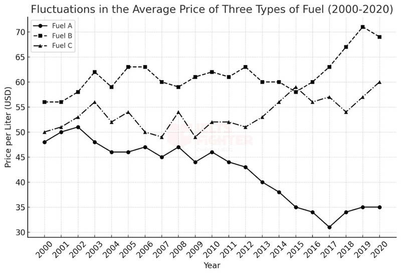
The line graph illustrates the fluctuations in the average price per liter of three different types of fuel—Fuel A, Fuel B, and Fuel C—between 2000 and 2020.
Overall, all three fuel types showed noticeable fluctuations throughout the period, with Fuel B maintaining the highest price. Meanwhile, Fuel A experienced the most stable price changes compared to the others.
Fuel B started at around 60 USD per liter in 2000 and showed significant price volatility, reaching peaks and troughs multiple times. Despite its fluctuations, it remained the most expensive fuel type throughout the period. Fuel C followed a similar trend, beginning at approximately 55 USD per liter and experiencing several price surges and declines over time.
In contrast, Fuel A exhibited the least variation in price, starting at around 50 USD per liter. While it also experienced fluctuations, they were relatively minor compared to the other two fuel types. By 2020, Fuel A remained the most stable, while Fuel B and Fuel C continued to show volatility. These trends suggest that Fuel A was the most reliable in terms of pricing, while Fuel B and Fuel C were more affected by market fluctuations.
Biểu đồ đường minh họa sự biến động của giá trung bình trên mỗi lít của ba loại nhiên liệu—Nhiên liệu A, Nhiên liệu B và Nhiên liệu C—trong giai đoạn từ năm 2000 đến 2020.
Nhìn chung, cả ba loại nhiên liệu đều có sự dao động đáng kể trong suốt thời kỳ này, với Nhiên liệu B luôn duy trì mức giá cao nhất. Trong khi đó, Nhiên liệu A có mức biến động ít hơn so với hai loại còn lại.
Nhiên liệu B bắt đầu ở mức khoảng 60 USD/lít vào năm 2000 và có những biến động lớn, với nhiều đợt tăng và giảm giá mạnh. Mặc dù giá thay đổi liên tục, Nhiên liệu B vẫn là loại nhiên liệu đắt nhất trong toàn bộ giai đoạn. Tương tự, Nhiên liệu C cũng có xu hướng dao động mạnh, từ mức 55 USD/lít vào năm 2000 và trải qua nhiều đợt tăng giảm trong suốt thời gian này.
Ngược lại, Nhiên liệu A có mức biến động ít hơn đáng kể. Khởi điểm ở mức 50 USD/lít, loại nhiên liệu này cũng có những thay đổi về giá, nhưng nhìn chung ổn định hơn so với Nhiên liệu B và C. Đến năm 2020, giá Nhiên liệu A vẫn duy trì tính ổn định, trong khi Nhiên liệu B và C tiếp tục có sự biến động mạnh. Những xu hướng này cho thấy rằng Nhiên liệu A có giá cả đáng tin cậy nhất, trong khi Nhiên liệu B và C bị ảnh hưởng nhiều hơn bởi sự biến động của thị trường.
Uncommon Words and Collocations
- Price volatility(/praɪs vɒləˈtɪləti/, noun phrase): Biến động giá cả
- Peaks and troughs(/piːks ænd trɒfs/, noun phrase): Các mức cao và thấp của giá cả
- Relatively minor(/ˈrɛlətɪvli ˈmaɪnər/, adjective phrase): Tương đối nhỏ
- Market fluctuations(/ˈmɑːrkɪt flʌktʃuˈeɪʃənz/, noun phrase): Sự dao động của thị trường
- Reliable pricing(/rɪˈlaɪəbl ˈpraɪsɪŋ/, noun phrase): Giá cả ổn định
Bài mẫu 4
Đề bài:
The line graph illustrates the average monthly temperature in three cities—City A, City B, and City C—throughout the year.
Summarise the information by selecting and reporting the main features and making comparisons where relevant.
Outline
| Introduction |
The line graph presents the average monthly temperature trends in three different cities over the course of a year. Biểu đồ đường thể hiện nhiệt độ trung bình hàng tháng tại ba thành phố khác nhau trong suốt một năm. |
| Overview |
Temperatures in all three cities follow a similar pattern, rising from January to July before declining towards December. Nhiệt độ ở cả ba thành phố có xu hướng giống nhau, tăng dần từ tháng 1 đến tháng 7, sau đó giảm dần về cuối năm. |
| Body Paragraph 1 |
Describe the trends from January to July for all three cities, highlighting the steady increase in temperatures. Mô tả xu hướng từ tháng 1 đến tháng 7 của cả ba thành phố, nhấn mạnh sự gia tăng ổn định của nhiệt độ. |
| Body Paragraph 2 |
Explain the trends from August to December, focusing on the decline in temperatures across all cities. Giải thích xu hướng từ tháng 8 đến tháng 12, tập trung vào sự giảm dần của nhiệt độ ở cả ba thành phố. |
Sample Essay
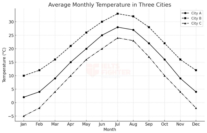
The line graph presents the average monthly temperatures in three different cities throughout the year.
Overall, temperatures in all three cities follow a similar trend, increasing from January to July before gradually declining towards December. Among the three, City B maintains the highest temperatures, while City C consistently experiences the lowest.
Between January and July, temperatures rise steadily in all three cities. In City A, the temperature starts at around 2°C in January and climbs to approximately 27°C in July. Similarly, City B begins at around 10°C, increasing sharply to a peak of over 30°C in July. City C, which records the lowest temperatures, starts below freezing at -3°C in January and follows a gradual upward trend, reaching just above 22°C at its highest point in July.
From August to December, temperatures steadily decline in those three cities. In City A, the temperature falls from 27°C in July to roughly 3°C by December. City B also sees a decrease from its peak of 32°C to around 12°C in the final month. Meanwhile, City C, after reaching a peak of 22°C in July, experiences a sharp decline, dropping below freezing to approximately -2°C in December. Despite the differences in temperature range, all three cities exhibit a similar seasonal pattern.
Biểu đồ đường thể hiện nhiệt độ trung bình hàng tháng tại ba thành phố khác nhau trong suốt một năm.
Nhìn chung, nhiệt độ ở cả ba thành phố đều có xu hướng tương tự nhau, tăng dần từ tháng 1 đến tháng 7 trước khi giảm dần về cuối năm. Trong ba thành phố, thành phố B có nhiệt độ cao nhất, trong khi thành phố C luôn có nhiệt độ thấp nhất.
Từ tháng 1 đến tháng 7, nhiệt độ ở cả ba thành phố đều tăng dần. Ở thành phố A, nhiệt độ khởi điểm khoảng 2°C vào tháng 1 và tăng lên khoảng 27°C vào tháng 7. Tương tự, thành phố B bắt đầu ở mức khoảng 10°C và tăng mạnh lên mức cao nhất hơn 30°C vào tháng 7. Thành phố C, nơi có nhiệt độ thấp nhất, bắt đầu dưới mức đóng băng ở -3°C vào tháng 1, sau đó tăng dần và đạt mức cao nhất khoảng 22°C vào tháng 7.
Từ tháng 8 đến tháng 12, nhiệt độ ở cả ba thành phố giảm dần. Ở thành phố A, nhiệt độ giảm từ 27°C vào tháng 7 xuống còn khoảng 3°C vào tháng 12. Thành phố B cũng chứng kiến sự suy giảm từ đỉnh 32°C xuống khoảng 12°C vào tháng cuối cùng. Trong khi đó, thành phố C sau khi đạt mức cao nhất 22°C vào tháng 7 đã giảm mạnh xuống dưới mức đóng băng, còn khoảng -2°C vào tháng 12. Mặc dù có sự khác biệt về phạm vi nhiệt độ, cả ba thành phố đều thể hiện một mô hình thời tiết theo mùa tương tự nhau.
Uncommon Words & Collocations
- Follow a similar trend(/ˈfɒl.əʊ ə ˈsɪm.ɪ.lə trend/ - verb phrase): Có xu hướng tương tự
- Gradually decline(/ˈɡrædʒ.u.ə.li dɪˈklaɪn/ - verb phrase): Giảm dần
- Maintain the highest temperatures(/meɪnˈteɪn ðə ˈhaɪ.ɪst ˈtɛm.prə.tʃərz/ - verb phrase): Duy trì mức nhiệt độ cao nhất
- Rise steadily(/raɪz ˈstɛd.ɪ.li/ - verb phrase): Tăng đều
- Increase sharply(/ɪnˈkriːs ˈʃɑːp.li/ - verb phrase): Tăng mạnh
- Reach a peak(/riːtʃ ə piːk/ - verb phrase): Đạt đỉnh
- Below freezing(/bɪˈləʊ ˈfriː.zɪŋ/ - adjective phrase): Dưới mức đóng băng
- Follow a gradual upward trend(/ˈfɒl.əʊ ə ˈɡrædʒ.u.əl ˈʌp.wəd trend/ - verb phrase): Theo xu hướng tăng dần
- Steadily decline(/ˈstɛd.ɪ.li dɪˈklaɪn/ - verb phrase): Giảm đều
- Drop below freezing(/drɒp bɪˈləʊ ˈfriː.zɪŋ/ - verb phrase): Giảm xuống dưới mức đóng băng
- Exhibit a similar seasonal pattern(/ɪɡˈzɪb.ɪt ə ˈsɪm.ɪ.lə ˈsiː.zən.əl ˈpæt.ən/ - verb phrase): Thể hiện một mô hình theo mùa tương tự
Bài mẫu 5
Đề bài:
The line graph shows the annual production of three different types of crops from 2000 to 2025.
Summarise the information by selecting and reporting the main features, and make comparisons where relevant.
Outline
| Introduction |
The line graph illustrates the annual production of three types of crops—Crop A, Crop B, and Crop C—from 2000 to 2025. Biểu đồ đường minh họa sản lượng hàng năm của ba loại cây trồng—Cây trồng A, Cây trồng B và Cây trồng C—từ năm 2000 đến 2025. |
| Overview |
Overall, all three crops experienced an upward trend in production, though Crop A fluctuated the most. Nhìn chung, cả ba loại cây trồng đều có xu hướng tăng trưởng, mặc dù Cây trồng A có nhiều biến động nhất. |
| Body Paragraph 1 |
Describe the fluctuations in Crop A and its dominance in production. Mô tả sự biến động của Cây trồng A và sự vượt trội của nó về sản lượng. |
| Body Paragraph 2 |
Explain the more stable growth in Crop B and Crop C, with Crop C having the lowest but increasing steadily. Giải thích sự tăng trưởng ổn định hơn của Cây trồng B và Cây trồng C, trong đó Cây trồng C có sản lượng thấp nhất nhưng đang tăng dần. |
Sample Essay
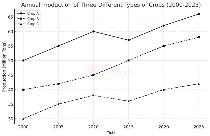
The line graph illustrates the annual production of three different types of crops—Crop A, Crop B, and Crop C—from 2000 to 2025.
Overall, the production of all three crops increased over the period, but Crop A exhibited the most fluctuations. Crop A consistently remained the highest-yielding crop, while Crop C had the lowest production but showed gradual growth.
In 2000, the production of Crop A started at 50 million tons and rose to 60 million tons by 2010. However, this figure dropped slightly to 57 million tons in 2015 before recovering and reaching 66 million tons in 2025. Despite the fluctuations, it remained the most productive crop throughout the period.
Meanwhile, Crop B had a steadier growth pattern, increasing from 40 million tons in 2000 to 58 million tons in 2025. Similarly, Crop C started with the lowest production at 30 million tons in 2000 but saw continuous growth, reaching 42 million tons by 2025. These trends indicate that while Crop A had the most fluctuations, Crop B and Crop C followed a more stable upward trend, with Crop C showing the slowest but steady improvement.
Biểu đồ đường minh họa sản lượng hàng năm của ba loại cây trồng khác nhau—Cây trồng A, Cây trồng B và Cây trồng C—trong giai đoạn từ năm 2000 đến 2025.
Nhìn chung, sản lượng của cả ba loại cây trồng đều tăng lên trong giai đoạn này, nhưng Cây trồng A có nhiều biến động nhất. Cây trồng A liên tục duy trì sản lượng cao nhất, trong khi Cây trồng C có mức sản xuất thấp nhất nhưng vẫn tăng trưởng đều đặn.
Năm 2000, sản lượng của Cây trồng A bắt đầu ở mức 50 triệu tấn và tăng lên 60 triệu tấn vào năm 2010. Tuy nhiên, con số này giảm nhẹ xuống còn 57 triệu tấn vào năm 2015 trước khi phục hồi và đạt 66 triệu tấn vào năm 2025. Mặc dù có sự dao động, đây vẫn là loại cây có sản lượng cao nhất trong suốt giai đoạn.
Trong khi đó, Cây trồng B có mức tăng trưởng ổn định hơn, tăng từ 40 triệu tấn vào năm 2000 lên 58 triệu tấn vào năm 2025. Tương tự, Cây trồng C có sản lượng thấp nhất, chỉ 30 triệu tấn vào năm 2000, nhưng không ngừng tăng lên, đạt 42 triệu tấn vào năm 2025. Những xu hướng này cho thấy rằng trong khi Cây trồng A có nhiều biến động, Cây trồng B và Cây trồng C có xu hướng tăng ổn định hơn, với Cây trồng C có tốc độ tăng trưởng chậm nhưng bền vững.
Uncommon Words and Collocations
- Fluctuations in production(/ˌflʌktʃuˈeɪʃənz ɪn prəˈdʌkʃən/, noun phrase): Sự biến động trong sản xuất
- Highest-yielding crop(/ˈhaɪɪst ˈjiːldɪŋ krɒp/, noun phrase): Loại cây có sản lượng cao nhất
- Gradual growth(/ˈɡrædʒuəl ɡroʊθ/, noun phrase): Sự tăng trưởng dần dần
- Steady upward trend(/ˈstɛdi ˈʌpwərd trɛnd/, noun phrase): Xu hướng tăng ổn định
- Slow but sustainable improvement(/sloʊ bʌt səˈsteɪnəbl ɪmˈpruːvmənt/, noun phrase): Sự cải thiện chậm nhưng bền vững
Bài mẫu 6
Đề bài:
The line graph shows the number of people visiting three different tourist attractions from 1990 to 2025.
Summarise the information by selecting and reporting the main features, and make comparisons where relevant.
Outline
| Introduction |
The line graph illustrates the number of visitors (in millions) to three different tourist attractions—Attraction A, Attraction B, and Attraction C—between 1990 and 2025. Biểu đồ đường minh họa số lượng du khách (tính bằng triệu người) đến ba điểm du lịch khác nhau—Điểm du lịch A, Điểm du lịch B và Điểm du lịch C—từ năm 1990 đến 2025. |
| Overview |
The number of visitors to all three attractions generally increased over time, despite some fluctuations. Số lượng du khách đến cả ba điểm du lịch nhìn chung tăng theo thời gian, mặc dù có một số biến động. |
| Body Paragraph 1 |
Describe the trends in Attraction A, which had the highest number of visitors, and Attraction B, which also experienced an upward trend. Mô tả xu hướng của Điểm du lịch A, nơi có số lượng khách du lịch cao nhất, và Điểm du lịch B, nơi có mức tăng trưởng ổn định. |
| Body Paragraph 2 |
Explain the trends in Attraction C, which had the lowest visitor numbers but saw continuous growth. Giải thích xu hướng của Điểm du lịch C, nơi có số lượng khách du lịch thấp nhất nhưng vẫn duy trì sự tăng trưởng liên tục. |
Sample Essay
The line graph illustrates the number of visitors (in millions) to three different tourist attractions—Attraction A, Attraction B, and Attraction C—between 1990 and 2025.
Overall, all three attractions saw an increase in visitor numbers over the period, although there were some fluctuations. Attraction A remained the most popular destination throughout, while Attraction C had the fewest visitors but showed consistent growth.
In 1990, approximately 10 million people visited Attraction A, and this figure steadily increased to 20 million by 2015. Despite a minor decline in 2000, when the number fell from 15 to 13 million, Attraction A maintained its leading position in visitor numbers, reaching 22 million by 2025.
Similarly, Attraction B saw an upward trend, starting at 8 million visitors in 1990 and rising gradually to 16 million by 2020. Attraction C, on the other hand, had the lowest visitor numbers at the beginning of the period (5 million in 1990), but the figure doubled to 10 million by 2010 and continued growing steadily to 16 million by 2025. These trends suggest that while Attraction A consistently remained the most visited, Attraction C experienced the most significant growth in relative terms.
Biểu đồ đường minh họa số lượng khách du lịch (tính bằng triệu người) đến ba điểm tham quan du lịch khác nhau từ năm 1990 đến 2025.
Nhìn chung, cả ba điểm du lịch đều ghi nhận sự gia tăng về số lượng du khách trong suốt giai đoạn, mặc dù có một số biến động. Điểm du lịch A vẫn là điểm đến phổ biến nhất trong suốt giai đoạn, trong khi Điểm du lịch C có lượng khách thấp nhất nhưng có tốc độ tăng trưởng ổn định.
Năm 1990, khoảng 10 triệu người đã đến Điểm du lịch A, và con số này tăng dần lên 20 triệu vào năm 2015. Mặc dù có sự sụt giảm nhẹ vào năm 2000, khi số du khách giảm từ 15 triệu xuống 13 triệu, Điểm du lịch A vẫn duy trì vị trí dẫn đầu, đạt 22 triệu lượt khách vào năm 2025.
Tương tự, Điểm du lịch B có xu hướng tăng lên, từ 8 triệu khách vào năm 1990 và tăng dần lên 16 triệu vào năm 2020. Trong khi đó, Điểm du lịch C có lượng khách thấp nhất vào năm 1990 (5 triệu), nhưng con số này đã tăng gấp đôi lên 10 triệu vào năm 2010 và tiếp tục tăng đều đặn lên 16 triệu vào năm 2025. Những xu hướng này cho thấy rằng mặc dù Điểm du lịch A vẫn là nơi thu hút khách nhiều nhất, nhưng Điểm du lịch C có tốc độ tăng trưởng đáng kể nhất theo tỷ lệ phần trăm.
Uncommon Words and Collocations
- Tourist attraction(/ˈtʊərɪst əˈtrækʃən/, noun phrase): Điểm du lịch
- Fluctuations in visitor numbers(/ˌflʌktʃuˈeɪʃənz ɪn ˈvɪzɪtər ˈnʌmbərz/, noun phrase): Sự dao động về số lượng du khách
- Maintain a leading position(/meɪnˈteɪn ə ˈliːdɪŋ pəˈzɪʃən/, verb phrase): Duy trì vị trí dẫn đầu
- Gradual increase(/ˈɡrædʒuəl ˈɪnkris/, noun phrase): Sự gia tăng từ từ
- Significant growth in relative terms(/sɪɡˈnɪfɪkənt ɡroʊθ ɪn ˈrɛlətɪv tɜːrmz/, noun phrase): Tăng trưởng đáng kể theo tỷ lệ phần trăm
Bài mẫu 7
Đề bài:
The line graph shows the proportion of three different sources of energy used in a country from 1990 to 2025.
Summarise the information by selecting and reporting the main features, and make comparisons where relevant.
Outline
|
Introduction |
The line graph illustrates the percentage of total energy consumption coming from three different sources—Energy Source A, Energy Source B, and Energy Source C—between 1990 and 2025. Biểu đồ đường minh họa tỷ lệ tiêu thụ năng lượng từ ba nguồn khác nhau—Nguồn năng lượng A, Nguồn năng lượng B và Nguồn năng lượng C—trong giai đoạn từ năm 1990 đến năm 2025. |
|
Overview |
The three energy sources fluctuated significantly over the period, frequently intersecting each other. Cả ba nguồn năng lượng đều có sự biến động đáng kể trong suốt giai đoạn, với nhiều lần giao cắt nhau. |
|
Body Paragraph 1 |
Describe the overall decline in Energy Source A and its interactions with the other two sources. Mô tả sự suy giảm chung của Nguồn năng lượng A và sự tương tác của nó với hai nguồn còn lại. |
|
Body Paragraph 2 |
Explain the fluctuations in Energy Source B and Energy Source C, noting their points of intersection with Energy Source A. Giải thích sự dao động của Nguồn năng lượng B và Nguồn năng lượng C, nhấn mạnh các điểm giao nhau với Nguồn năng lượng A. |
Sample Essay
The line graph illustrates the proportion of three different energy sources—Energy Source A, Energy Source B, and Energy Source C—used in a country between 1990 and 2025.
Overall, the three energy sources fluctuated significantly over time, frequently intersecting each other. Energy Source A experienced an overall decline, while Energy Source B and Energy Source C fluctuated but remained relatively stable.
In 1990, Energy Source A accounted for the highest share of energy consumption at 40%, but this figure declined steadily to around 28% in 2005. However, it rebounded slightly before falling again to 38% by 2025. Notably, Energy Source A crossed paths with Energy Source B around 2010 and with Energy Source C at several points.
Energy Source B followed an opposite trend, starting at 25% in 1990 and rising to 35% by 2005. However, its share fluctuated afterward, dropping to 28% in 2015 before climbing back to 27% by 2025. Similarly, Energy Source C remained relatively stable, fluctuating between 35% and 38% throughout the period. The frequent intersections of these three sources indicate a dynamic shift in energy consumption preferences over time.
Biểu đồ đường minh họa tỷ lệ tiêu thụ năng lượng từ ba nguồn khác nhau trong giai đoạn từ năm 1990 đến năm 2025.
Nhìn chung, cả ba nguồn năng lượng đều có sự biến động đáng kể trong suốt giai đoạn, với nhiều lần giao cắt nhau. Nguồn năng lượng A có xu hướng giảm dần, trong khi Nguồn năng lượng B và C dao động nhưng tương đối ổn định.
Năm 1990, Nguồn năng lượng A chiếm tỷ lệ cao nhất với 40%, nhưng con số này giảm đều đặn xuống khoảng 28% vào năm 2005. Tuy nhiên, nó đã phục hồi nhẹ trước khi tiếp tục giảm xuống 38% vào năm 2025. Đáng chú ý, Nguồn năng lượng A cắt ngang Nguồn năng lượng B vào khoảng năm 2010 và giao với Nguồn năng lượng C tại nhiều thời điểm.
Trong khi đó, Nguồn năng lượng B có xu hướng ngược lại, bắt đầu ở mức 25% vào năm 1990 và tăng lên 35% vào năm 2005. Tuy nhiên, sau đó tỷ lệ này dao động, giảm xuống 28% vào năm 2015 trước khi tăng nhẹ lên 27% vào năm 2025. Tương tự, Nguồn năng lượng C vẫn duy trì mức ổn định, dao động trong khoảng từ 35% đến 38% trong suốt giai đoạn. Những giao điểm thường xuyên giữa ba nguồn này cho thấy sự thay đổi linh hoạt trong xu hướng tiêu thụ năng lượng theo thời gian.
Uncommon Words and Collocations
- Fluctuate significantly(/ˈflʌktʃuˌeɪt sɪɡˈnɪfɪkəntli/, verb phrase): Dao động đáng kể
- Intersect(/ˌɪntərˈsɛkt/, verb): Giao nhau
- Dynamic shift(/daɪˈnæmɪk ʃɪft/, noun phrase): Sự thay đổi linh hoạt
- Rebound slightly(/ˈriːbaʊnd ˈslaɪtli/, verb phrase): Phục hồi nhẹ
- Energy consumption preferences(/ˈɛnərdʒi kənˈsʌmpʃən ˈprɛfərənsɪz/, noun phrase): Xu hướng tiêu thụ năng lượng
Bài mẫu 8
Đề bài:
The line graph shows the employment rate in four different industries from 1990 to 2025.
Summarise the information by selecting and reporting the main features, and make comparisons where relevant.
Outline
|
Introduction |
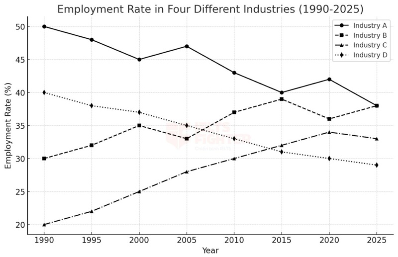
The line graph illustrates the percentage of people employed in four different industries—Industry A, Industry B, Industry C, and Industry D—between 1990 and 2025. Biểu đồ đường minh họa tỷ lệ lao động làm việc trong bốn ngành công nghiệp khác nhau—Ngành A, Ngành B, Ngành C, và Ngành D—trong giai đoạn từ năm 1990 đến năm 2025. |
|
Overview |
Employment trends in all four industries fluctuated over time, with several intersections between them. Tỷ lệ việc làm trong cả bốn ngành có sự dao động theo thời gian, với nhiều điểm giao cắt giữa các ngành. |
|
Body Paragraph 1 |
Describe the overall decline in Industry A and Industry D, and their points of intersection with other industries. Mô tả xu hướng giảm chung của Ngành A và Ngành D, và những điểm giao cắt của chúng với các ngành khác. |
|
Body Paragraph 2 |
Explain the increase in Industry B and Industry C, highlighting the fluctuations and key intersections. Giải thích sự tăng trưởng của Ngành B và Ngành C, nhấn mạnh các điểm giao nhau và những biến động chính. |
Sample Essay
The line graph illustrates the employment rate in four different industries—Industry A, Industry B, Industry C, and Industry D—between 1990 and 2025.
Overall, employment rates in all four industries fluctuated significantly over time, with multiple intersections. Industry A and Industry D showed a downward trend, whereas Industry B and Industry C experienced steady growth.
In 1990, Industry A had the highest employment rate at 50%, but this figure gradually declined to 38% by 2025, despite minor recoveries around 2000 and 2015. Industry D followed a similar trend, starting at 40% and dropping consistently to 29% in 2025. Notably, Industry A and Industry B intersected in 2010, while Industry D and Industry C had similar employment rates around 2020.
On the other hand, Industry B and Industry C exhibited an upward trend. Industry B grew from 30% in 1990 to a peak of 39% in 2020 before stabilizing at 38% in 2025. Similarly, Industry C increased from 20% in 1990 to 34% in 2020, experiencing steady growth. The frequent intersections among the four industries indicate shifts in employment trends over time.
Biểu đồ đường minh họa tỷ lệ việc làm trong bốn ngành công nghiệp khác nhau từ năm 1990 đến năm 2025.
Nhìn chung, tỷ lệ lao động trong cả bốn ngành có sự dao động đáng kể theo thời gian, với nhiều điểm giao nhau. Ngành A và Ngành D có xu hướng giảm, trong khi Ngành B và Ngành C có sự tăng trưởng ổn định.
Năm 1990, Ngành A có tỷ lệ việc làm cao nhất, ở mức 50%, nhưng con số này giảm dần xuống còn 38% vào năm 2025, dù có sự phục hồi nhẹ vào khoảng năm 2000 và 2015. Ngành D cũng có xu hướng giảm tương tự, từ 40% xuống còn 29% vào năm 2025. Đáng chú ý, Ngành A và Ngành B giao nhau vào khoảng năm 2010, trong khi Ngành D và Ngành C có tỷ lệ tương đồng vào khoảng năm 2020.
Ngược lại, Ngành B và Ngành C có xu hướng tăng lên. Ngành B tăng từ 30% năm 1990 lên mức cao nhất 39% vào năm 2020 trước khi ổn định ở mức 38% vào năm 2025. Tương tự, Ngành C tăng từ 20% vào năm 1990 lên 34% vào năm 2020, cho thấy sự phát triển liên tục. Những giao điểm thường xuyên giữa các ngành này phản ánh sự thay đổi linh hoạt trong thị trường lao động theo thời gian.
Uncommon Words and Collocations
- Employment trends(/ɪmˈplɔɪmənt trɛndz/, noun phrase): Xu hướng việc làm
- Frequent intersections(/ˈfriːkwənt ˌɪntərˈsɛkʃənz/, noun phrase): Các điểm giao nhau thường xuyên
- Downward trend(/ˈdaʊnwərd trɛnd/, noun phrase): Xu hướng giảm
- Steady growth(/ˈstɛdi ɡroʊθ/, noun phrase): Sự tăng trưởng ổn định
- Shifts in employment(/ʃɪfts ɪn ɪmˈplɔɪmənt/, noun phrase): Sự thay đổi trong xu hướng việc làm
Bài mẫu 9
Đề bài:
The line graph illustrates the market share percentage of four major smartphone brands—Apple, Samsung, Huawei, and Xiaomi—from 2005 to a projected figure in 2030.
Summarise the information by selecting and reporting the main features and making comparisons where relevant.
Outline
| Introduction |
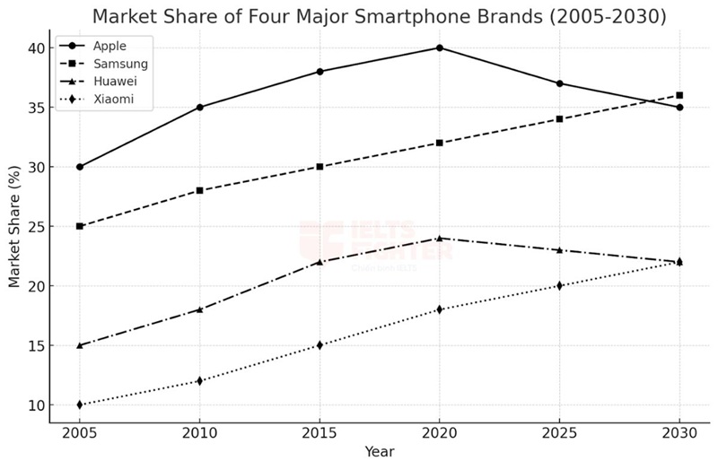
The line graph presents the market share trends of Apple, Samsung, Huawei, and Xiaomi between 2005 and 2030. Biểu đồ đường thể hiện xu hướng thị phần của bốn thương hiệu điện thoại thông minh—Apple, Samsung, Huawei và Xiaomi—từ năm 2005 đến 2030. |
| Overview |
Apple and Huawei experienced fluctuations over the period, with Apple reaching a peak before declining. Apple và Huawei có sự biến động trong thị phần, với Apple đạt đỉnh vào năm 2020 trước khi giảm dần. |
| Body Paragraph 1 |
Describe the fluctuation of Apple and Huawei, focusing on Apple's peak in 2020 and subsequent decline, as well as Huawei's growth until 2020 followed by a slight drop. Mô tả sự dao động của Apple và Huawei, tập trung vào mức đỉnh của Apple vào năm 2020 trước khi giảm, cũng như sự tăng trưởng của Huawei đến năm 2020, sau đó suy giảm nhẹ. |
| Body Paragraph 2 |
Explain the steady rise in Samsung and Xiaomi’s market shares, highlighting their continuous growth without major declines. Phân tích sự tăng trưởng ổn định của Samsung và Xiaomi, nhấn mạnh vào xu hướng gia tăng liên tục mà không có sự sụt giảm đáng kể. |
Sample Essay
The line graph presents the market share trends of Apple, Samsung, Huawei, and Xiaomi in the smartphone industry from 2005 to 2030.
Overall, Apple and Huawei have experienced fluctuations, while Samsung and Xiaomi have displayed steady upward trends. Apple reached a peak in 2020 before its market share declined, whereas Samsung has consistently grown over time and will likely surpass Apple by 2030.
Apple’s market share started at 30% in 2005 and rose steadily to 35% in 2015 before peaking at 40% in 2020. However, this figure has declined slightly since then and is projected to end at around 35% by 2030. Similarly, Huawei saw steady growth from 15% in 2005 to a peak of nearly 25% in 2020, after which its share declined slightly. By 2030, it is expected to reach approximately 22%.
By contrast, Samsung has followed a consistent upward trajectory, beginning at 25% in 2005 and increasing to around 30% by 2015. This trend is expected to continue, with Samsung’s share projected to reach 35% by 2030, overtaking Apple. Meanwhile, Xiaomi, which started at just above 10% in 2005, has seen steady gains and is expected to reach 22% by 2030, nearly equaling Huawei’s market share.
Biểu đồ đường thể hiện xu hướng thị phần của Apple, Samsung, Huawei và Xiaomi trong ngành công nghiệp điện thoại thông minh từ năm 2005 đến năm 2030.
Nhìn chung, Apple và Huawei đã trải qua những biến động, trong khi Samsung và Xiaomi đã cho thấy xu hướng tăng trưởng ổn định. Apple đạt đỉnh vào năm 2020 trước khi thị phần của hãng suy giảm, trong khi đó Samsung đã tăng trưởng liên tục theo thời gian và có khả năng sẽ vượt qua Apple vào năm 2030.
Thị phần của Apple bắt đầu ở mức 30% vào năm 2005 và tăng đều đặn lên 35% vào năm 2015 trước khi đạt đỉnh 40% vào năm 2020. Tuy nhiên, con số này đã giảm nhẹ kể từ đó và được dự báo sẽ kết thúc ở khoảng 35% vào năm 2030. Tương tự, Huawei đã chứng kiến sự tăng trưởng ổn định từ 15% vào năm 2005 lên mức cao nhất gần 25% vào năm 2020, sau đó thị phần của hãng giảm nhẹ. Đến năm 2030, con số này được dự đoán sẽ đạt khoảng 22%.
Ngược lại, Samsung đã theo một quỹ đạo tăng trưởng ổn định, bắt đầu ở mức 25% vào năm 2005 và tăng lên khoảng 30% vào năm 2015. Xu hướng này được kỳ vọng sẽ tiếp tục, với thị phần của Samsung được dự báo sẽ đạt 35% vào năm 2030, vượt qua Apple. Trong khi đó, Xiaomi, vốn khởi đầu ở mức hơn 10% vào năm 2005, đã có mức tăng trưởng ổn định và dự kiến sẽ đạt 22% vào năm 2030, gần bằng thị phần của Huawei.
Uncommon Words & Collocations
- Market share trends(/ˈmɑː.kɪt ʃeə trɛndz/ - noun phrase): Xu hướng thị phần
- Steady upward trend(/ˈstɛd.i ˈʌp.wəd trɛnd/ - noun phrase): Xu hướng tăng đều
- Experience fluctuations(/ɪkˈspɪə.ri.əns ˌflʌk.tʃuˈeɪ.ʃənz/ - verb phrase): Trải qua biến động
- Peak at(/piːk æt/ - verb phrase): Đạt đỉnh ở
- Decline slightly(/dɪˈklaɪn ˈslaɪt.li/ - verb phrase): Giảm nhẹ
- Overtake(/ˌəʊ.vəˈteɪk/ - verb): Vượt qua
- Consistent growth(/kənˈsɪs.tənt ɡrəʊθ/ - noun phrase): Sự tăng trưởng ổn định
- Follow a trajectory(/ˈfɒl.əʊ ə trəˈdʒɛk.tər.i/ - verb phrase): Theo một quỹ đạo
- Projected to reach(/prəˈdʒɛk.tɪd tu riːtʃ/ - verb phrase): Dự báo sẽ đạt
- Steady gains(/ˈstɛd.i ɡeɪnz/ - noun phrase): Mức tăng ổn định
Bài mẫu 10
Đề bài:
The line graph shows the number of electric vehicles sold by five major car manufacturers from 2010 to 2035.
Summarise the information by selecting and reporting the main features, and make comparisons where relevant.
Outline
| Introduction |
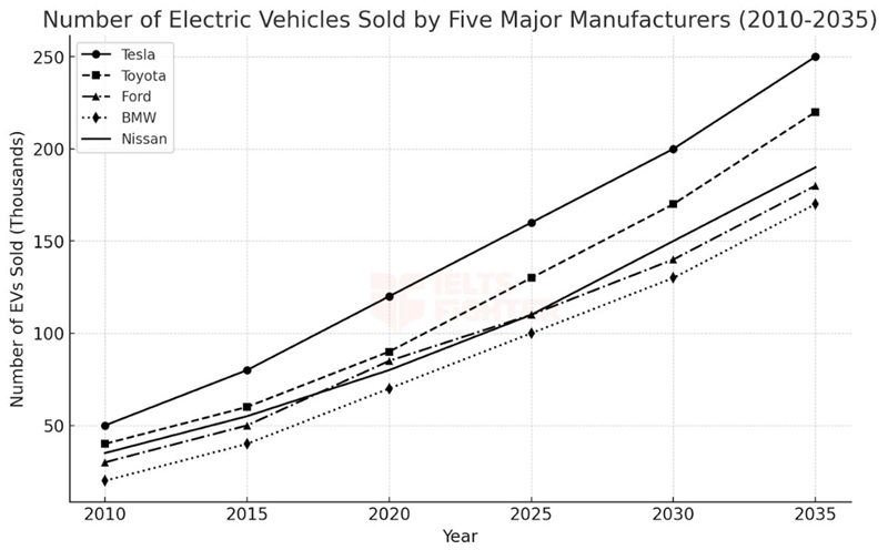
The line graph illustrates the number of electric vehicles (EVs) sold by five major car manufacturers—Tesla, Toyota, Ford, BMW, and Nissan—between 2010 and 2035. Biểu đồ đường minh họa số lượng xe điện (EV) được bán ra bởi năm nhà sản xuất ô tô lớn—Tesla, Toyota, Ford, BMW, và Nissan—từ năm 2010 đến 2035. |
| Overview |
All five manufacturers experienced significant growth in EV sales over the period. Tất cả năm nhà sản xuất đều có sự tăng trưởng đáng kể về doanh số bán xe điện trong suốt giai đoạn. |
| Body Paragraph 1 |
Describe Tesla’s dominance in EV sales and the steady rise of Toyota and Nissan. Mô tả sự thống trị của Tesla trong doanh số EV và sự tăng trưởng ổn định của Toyota và Nissan. |
| Body Paragraph 2 |
Explain the trends for Ford and BMW, highlighting their lower initial sales but notable increases. Giải thích xu hướng của Ford và BMW, nhấn mạnh mức doanh số ban đầu thấp hơn nhưng gia tăng đáng kể sau đó. |
Sample Essay
The line graph illustrates the number of electric vehicles (EVs) sold by five major car manufacturers—Tesla, Toyota, Ford, BMW, and Nissan—between 2010 and 2035.
Overall, EV sales increased significantly for all five manufacturers, with Tesla leading the market throughout the period. BMW, although initially selling the fewest EVs, also showed a steady upward trend.
In 2010, Tesla sold around 50,000 EVs, and this number rose sharply to 250,000 by 2035, making it the market leader. Toyota followed a similar trajectory, increasing from 40,000 sales in 2010 to 220,000 by the end of the period. Nissan also experienced substantial growth, rising from 35,000 to 190,000 EVs sold.
Meanwhile, Ford and BMW had lower starting points, with 30,000 and 20,000 sales in 2010, respectively. However, Ford’s EV sales nearly quadrupled to 180,000 by 2035, while BMW’s sales grew to 170,000. These trends suggest a strong shift towards electric vehicle adoption, with all manufacturers expanding their EV production.
Biểu đồ đường minh họa số lượng xe điện (EV) được bán ra bởi năm nhà sản xuất ô tô lớn từ năm 2010 đến 2035.
Nhìn chung, doanh số xe điện của tất cả năm nhà sản xuất đều tăng mạnh, với Tesla dẫn đầu thị trường trong suốt giai đoạn. BMW, dù có mức doanh số thấp nhất ban đầu, cũng cho thấy xu hướng tăng ổn định.
Năm 2010, Tesla bán khoảng 50.000 xe điện, và con số này tăng vọt lên 250.000 vào năm 2035, giúp hãng giữ vị trí dẫn đầu. Toyota cũng có sự tăng trưởng mạnh mẽ, từ 40.000 xe vào năm 2010 lên 220.000 vào cuối giai đoạn. Nissan có mức tăng đáng kể, từ 35.000 lên 190.000 xe bán ra.
Trong khi đó, Ford và BMW có mức doanh số ban đầu thấp hơn, với 30.000 và 20.000 xe vào năm 2010. Tuy nhiên, doanh số của Ford gần như tăng gấp bốn lần, đạt 180.000 vào năm 2035, trong khi BMW cũng đạt 170.000 xe bán ra. Những xu hướng này cho thấy sự dịch chuyển mạnh mẽ sang xe điện, với tất cả các nhà sản xuất đều mở rộng quy mô sản xuất EV.
Uncommon Words and Collocations
- Electric vehicle adoption(/ɪˈlɛktrɪk ˈviːɪkəl əˈdɒpʃən/, noun phrase): Sự chuyển đổi sang xe điện
- Market leader(/ˈmɑːrkɪt ˈliːdər/, noun phrase): Nhà dẫn đầu thị trường
- Expand production(/ɪkˈspænd prəˈdʌkʃən/, verb phrase): Mở rộng sản xuất
- Steady upward trend(/ˈstɛdi ˈʌpwərd trɛnd/, noun phrase): Xu hướng tăng ổn định
- Quadruple in sales(/kwɒˈdruːpəl ɪn seɪlz/, verb phrase): Tăng gấp bốn lần doanh số
Các bạn cùng tham khảo để lấy ý tưởng và lưu từ vựng nhé.
Ngoài ra mở rộng thêm với Hướng dẫn viết và bài mẫu Writing Task 1 Process: Apple juice, Geothermal, Hydroelectric, A lead pencil, Olive oil