Tổng hợp bài mẫu IELTS Writing Task 1 Pie Chart hay
Pie Chart là biểu đồ tròn trong IELTS Writing Task 1. Dạng đề này thường có 1 biểu đồ tròn trở lên, để so sánh theo các đối tượng, thời gian...khác nhau.
Trước khi tham khảo bài mẫu, chúng ta cùng điểm lại cách viết và một số điểm lưu ý.
Cách viết Pie Chart như thế nào?
Biểu đồ tròn sẽ có 1 hoặc nhiều hơn số lượng, có đề sẽ có 4-5 biểu đồ so sánh với mức độ cao hơn. Thường các đề thi IELTS Writing sẽ là đề từ 2 biểu đồ trở lên. Tổng các hạng mục sẽ là 100%.
Pie Chart có hai dạng là:
- Biểu đồ có thay đổi theo thời gian: Pie chart with timeline /Time graph/Dynamic charts
- Biểu đồ không có sự thay đổi theo thời gian: Pie chart without timeline/Comparison graph/ Static charts
Pie chart, hay còn gọi là biểu đồ tròn, là biểu đồ thể hiện tỷ trọng của một hạng mục so với tổng số. Một đặc trưng của dạng Pie chart là tổng số liệu của tất cả các hạng mục trong một Pie chart luôn là 100%.
Cấu trúc viết bài Pie Chart cơ bản là:
- Introduction: 1 sentence. Ở mở đầu bạn có thể paraphrase lại câu hỏi
- Overview: 1-2 sentences. Phần này nêu tổng quan, phân tích chung overview
- Body paragraph 1: 3-4 sentences. Ở body, thực hiện phân tích report data, describe trends/changes, make comparisons
- Body paragraph 2: 3-4 sentences. Tương tự thực hiện phân tích report data, describe trends/changes, make comparisons
Bài viết chi tiết IELTS Fighter đã chia sẻ kèm video tại: Cách viết IELTS Writing Task 1 Pie Chart
Dưới đây là bài mẫu để bạn mở rộng vốn từ và hiểu hơn cách viết, ý tưởng, phân tích hiệu quả cho dạng biểu đồ tròn nhé.
Bài mẫu Writing Task 1 Pie Chart
Các bài mẫu được đội ngũ học thuật IELTS Fighter xây dựng theo format:
- Đề bài chi tiết
- Outline viết bài gợi ý theo tiếng Anh - Việt
- Bài mẫu Anh - Việt tham khảo
- Từ vựng nổi bật để lưu sử dụng sau
Các bạn cùng tham khảo nhé.
Bài mẫu 1
Đề bài:
The charts show the proportion of different modes of transportation used by city residents in 2010 and 2020.
Summarise the information by selecting and reporting the main features, and make comparisons where relevant.
Outline
| Introduction |
The two pie charts compare the percentage of city residents using five different modes of transportation in 2010 and 2020. Hai biểu đồ tròn so sánh tỷ lệ cư dân thành phố sử dụng năm phương tiện di chuyển khác nhau vào năm 2010 và 2020. |
| Overview |
Cars remained the most popular mode of transport in both years, though their proportion decreased. Ô tô vẫn là phương tiện phổ biến nhất trong cả hai năm, nhưng tỷ lệ sử dụng đã giảm. |
| Body Paragraph 1 |
Discuss the decline in car usage and walking. Thảo luận về sự suy giảm của việc sử dụng ô tô và đi bộ. |
| Body Paragraph 2 |
Explain the increase in public transport and bicycle usage, while the percentage of people using other modes remained unchanged. Giải thích sự gia tăng của phương tiện công cộng và xe đạp, trong khi tỷ lệ sử dụng các phương tiện khác không thay đổi. |
Sample Essay
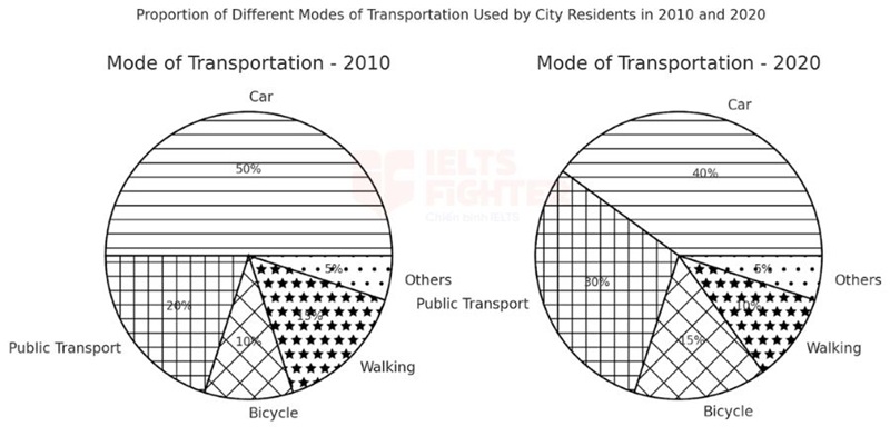
The two pie charts illustrate the proportion of city residents using five different types of transportation in 2010 and 2020.
Overall, cars remained the dominant mode of transport, but their proportion declined. Meanwhile, the percentage of people using public transport and bicycles increased, while walking became a less common means of travel.
In 2010, cars accounted for 50% of all transportation usage, but this figure dropped to 40% in 2020. Similarly, the proportion of people walking decreased from 15% to 10%. Meanwhile, the percentage of residents using other modes of transport remained unchanged at 5% in both years.
On the other hand, public transport and bicycles gained popularity over the decade. The proportion of city residents relying on public transport increased from 20% in 2010 to 30% in 2020, while bicycle usage grew from 10% to 15%. These trends indicate a shift towards more environmentally friendly modes of transportation.
Hai biểu đồ tròn minh họa tỷ lệ cư dân thành phố sử dụng năm loại phương tiện giao thông khác nhau vào năm 2010 và 2020.
Nhìn chung, ô tô vẫn là phương tiện di chuyển chủ yếu, nhưng tỷ lệ sử dụng đã giảm. Đồng thời, số người sử dụng phương tiện công cộng và xe đạp tăng lên, trong khi đi bộ trở nên ít phổ biến hơn.
Vào năm 2010, ô tô chiếm 50% tổng số phương tiện được sử dụng, nhưng con số này giảm xuống còn 40% vào năm 2020. Tương tự, tỷ lệ người đi bộ cũng giảm từ 15% xuống còn 10%. Trong khi đó, tỷ lệ cư dân sử dụng các phương tiện khác vẫn giữ nguyên ở mức 5% trong cả hai năm.
Mặt khác, phương tiện công cộng và xe đạp trở nên phổ biến hơn theo thời gian. Tỷ lệ người dân sử dụng phương tiện công cộng tăng từ 20% vào năm 2010 lên 30% vào năm 2020, trong khi tỷ lệ sử dụng xe đạp tăng từ 10% lên 15%. Những xu hướng này cho thấy sự dịch chuyển sang các phương tiện thân thiện với môi trường hơn.
Uncommon Words and Collocations
- Mode of transport(/məʊd əv ˈtrænspɔːt/, noun): Phương tiện di chuyển
- Dominant(/ˈdɒmɪnənt/, adjective): Chiếm ưu thế
- Environmentally friendly(/ɪnˌvaɪrənˈmɛntəli ˈfrɛndli/, adjective): Thân thiện với môi trường
- Proportion(/prəˈpɔːʃən/, noun): Tỷ lệ
- Shift towards(/ʃɪft təˈwɔːdz/, verb phrase): Xu hướng chuyển sang
Bài mẫu 2
Đề bài:
The charts show the proportion of different sources of government revenue in a certain country in 2010 and 2020.
Summarise the information by selecting and reporting the main features, and make comparisons where relevant.
Outline
| Introduction |
The two pie charts compare the percentage of revenue collected from five different sources by a government in a certain country in 2010 and 2020. Hai biểu đồ tròn so sánh tỷ lệ nguồn thu ngân sách từ năm hạng mục khác nhau của một chính phủ tại một quốc gia vào năm 2010 và 2020. |
| Overview |
Income tax was the primary source of government revenue in both years, and its share increased over time. Thuế thu nhập là nguồn thu chính trong cả hai năm và tỷ lệ này tăng theo thời gian. |
| Body Paragraph 1 |
Discuss the dominance of income tax and its increase over the decade. Thảo luận về sự chiếm ưu thế của thuế thu nhập và sự gia tăng của nó trong thập kỷ. |
| Body Paragraph 2 |
Explain the decline in corporate and sales tax, along with the unchanged contribution of customs duties and other revenue. Giải thích sự suy giảm của thuế doanh nghiệp và thuế bán hàng, cùng với việc không thay đổi của thuế nhập khẩu và các nguồn thu khác. |
Sample Essay
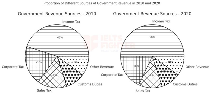
The two pie charts illustrate the proportion of government revenue generated from five different sources in a certain country in 2010 and 2020.
Overall, income tax accounted for the largest share of government revenue in both years, and its percentage increased over the decade. Meanwhile, corporate tax and sales tax saw a decline, while customs duties and other revenue sources remained unchanged.
In 2010, income tax was the dominant source of revenue, contributing 45% of the total government income. By 2020, this figure had risen to 50%, indicating a growing reliance on personal taxation. Meanwhile, corporate tax, which made up 20% of government revenue in 2010, dropped slightly to 18% in 2020.
Similarly, the percentage of revenue collected from sales tax decreased from 15% in 2010 to 12% in 2020. However, customs duties and other sources of revenue remained stable at 10% each in both years. These trends suggest that the government increasingly relied on income tax, while indirect taxation, such as sales tax, became less significant.
Hai biểu đồ tròn minh họa tỷ lệ nguồn thu ngân sách được tạo ra từ năm nguồn thu khác nhau tại một quốc gia vào năm 2010 và 2020.
Nhìn chung, thuế thu nhập chiếm tỷ lệ lớn nhất trong tổng nguồn thu ngân sách của chính phủ trong cả hai năm, và tỷ lệ này đã tăng theo thời gian. Trong khi đó, thuế doanh nghiệp và thuế bán hàng giảm, còn thuế nhập khẩu và các nguồn thu khác vẫn giữ nguyên.
Năm 2010, thuế thu nhập là nguồn thu chủ yếu, chiếm 45% tổng thu ngân sách của chính phủ. Đến năm 2020, con số này tăng lên 50%, cho thấy sự phụ thuộc ngày càng nhiều vào thuế thu nhập cá nhân. Trong khi đó, thuế doanh nghiệp, chiếm 20% tổng thu ngân sách vào năm 2010, giảm nhẹ xuống 18% vào năm 2020.
Tương tự, tỷ lệ thu ngân sách từ thuế bán hàng giảm từ 15% năm 2010 xuống còn 12% vào năm 2020. Tuy nhiên, thuế nhập khẩu và các nguồn thu khác vẫn giữ nguyên ở mức 10% trong cả hai năm. Những xu hướng này cho thấy rằng chính phủ ngày càng dựa vào thuế thu nhập, trong khi các loại thuế gián tiếp như thuế bán hàng trở nên ít quan trọng hơn.
Uncommon Words and Collocations
- Government revenue(/ˈɡʌvərnmənt ˈrɛvənuː/, noun): Doanh thu của chính phủ
- Income tax(/ˈɪnkʌm tæks/, noun): Thuế thu nhập
- Corporate tax(/ˈkɔːpərət tæks/, noun): Thuế doanh nghiệp
- Customs duties(/ˈkʌstəmz ˈdjuːtiz/, noun): Thuế nhập khẩu
- Indirect taxation(/ˌɪndəˈrɛkt tækˈseɪʃən/, noun): Thuế gián tiếp
Bài mẫu 3
Đề bài:
The charts show the proportion of water usage for different purposes in four different regions.
Summarise the information by selecting and reporting the main features, and make comparisons where relevant.
Outline
| Introduction |
The four pie charts compare the percentage of water consumption allocated to agriculture, industry, and domestic use in North America, Europe, Asia, and Africa. Bốn biểu đồ tròn so sánh tỷ lệ sử dụng nước cho nông nghiệp, công nghiệp và sinh hoạt tại Bắc Mỹ, Châu Âu, Châu Á và Châu Phi. |
| Overview |
Agriculture accounted for the highest share of water usage in Asia and Africa, whereas industry consumed the most water in North America and Europe. Nông nghiệp chiếm tỷ lệ sử dụng nước cao nhất tại Châu Á và Châu Phi, trong khi công nghiệp tiêu thụ nhiều nước nhất tại Bắc Mỹ và Châu Âu. |
| Body Paragraph 1 |
Discuss the dominance of agriculture in water usage in Asia and Africa. Thảo luận về sự chiếm ưu thế của nông nghiệp trong việc sử dụng nước ở Châu Á và Châu Phi. |
| Body Paragraph 2 |
Explain the higher industrial water consumption in North America and Europe, and the minimal share of domestic use across all regions. Giải thích mức tiêu thụ nước cao hơn của ngành công nghiệp ở Bắc Mỹ và Châu Âu, và tỷ lệ nhỏ của nước dùng cho sinh hoạt ở tất cả các khu vực. |
Sample Essay
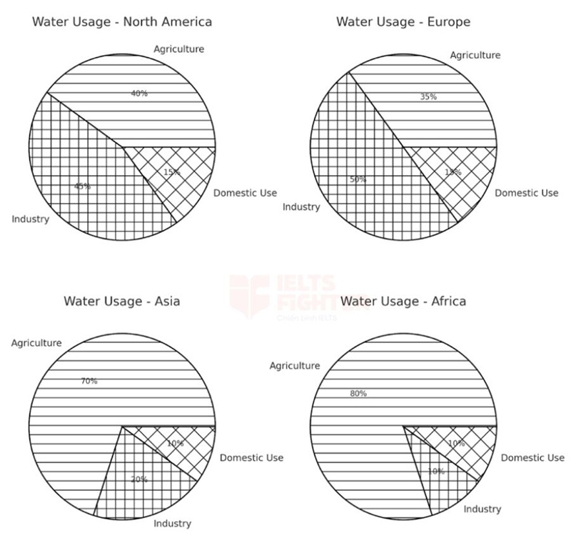
The four pie charts illustrate the proportion of water usage across three different sectors—agriculture, industry, and domestic use—in North America, Europe, Asia, and Africa.
Overall, agriculture accounted for the largest share of water consumption in Asia and Africa, whereas industry was the dominant sector in North America and Europe. In all four regions, domestic use represented the smallest percentage of total water consumption.
In Asia and Africa, agriculture consumed the vast majority of water, making up 70% and 80% of total usage, respectively. Industrial water use in these regions was significantly lower, at 20% in Asia and only 10% in Africa. Similarly, domestic use was the least significant category, accounting for just 10% in both regions.
By contrast, water consumption in North America and Europe followed a different pattern, with industry being the largest consumer. In North America, industrial water use accounted for 45% of total consumption, while agriculture followed closely at 40%. A similar trend was observed in Europe, where industry accounted for 50% of water usage, compared to 35% for agriculture. Domestic water use remained consistent in both regions at just 15%, further highlighting the contrast between regions dominated by agriculture and those driven by industrial consumption.
Bốn biểu đồ tròn minh họa tỷ lệ sử dụng nước trong ba lĩnh vực khác nhau—nông nghiệp, công nghiệp và sinh hoạt—tại Bắc Mỹ, Châu Âu, Châu Á và Châu Phi.
Nhìn chung, nông nghiệp chiếm tỷ lệ sử dụng nước cao nhất tại Châu Á và Châu Phi, trong khi công nghiệp là ngành tiêu thụ nước lớn nhất ở Bắc Mỹ và Châu Âu. Ở cả bốn khu vực, nước dùng cho sinh hoạt chiếm tỷ lệ thấp nhất trong tổng mức tiêu thụ nước.
Tại Châu Á và Châu Phi, nông nghiệp tiêu thụ phần lớn nước, chiếm lần lượt 70% và 80% tổng lượng nước sử dụng. Mức tiêu thụ nước của ngành công nghiệp ở hai khu vực này thấp hơn đáng kể, chỉ chiếm 20% ở Châu Á và 10% ở Châu Phi. Tương tự, nước dùng cho sinh hoạt là hạng mục ít quan trọng nhất, chỉ chiếm 10% ở cả hai khu vực.
Ngược lại, Bắc Mỹ và Châu Âu có xu hướng sử dụng nước khác biệt, với công nghiệp là lĩnh vực tiêu thụ nước lớn nhất. Ở Bắc Mỹ, công nghiệp sử dụng 45% tổng lượng nước, trong khi nông nghiệp đứng thứ hai với 40%. Xu hướng tương tự cũng được quan sát thấy ở Châu Âu, nơi công nghiệp chiếm 50% lượng nước sử dụng, so với 35% dành cho nông nghiệp. Nước dùng cho sinh hoạt vẫn giữ nguyên ở mức 15% tại cả hai khu vực, làm nổi bật sự khác biệt giữa các khu vực có nền kinh tế dựa vào nông nghiệp và công nghiệp.
Uncommon Words and Collocations
- Water consumption(/ˈwɔːtər kənˈsʌmpʃən/, noun): Mức tiêu thụ nước
- Dominant sector(/ˈdɒmɪnənt ˈsɛktər/, noun phrase): Ngành chiếm ưu thế
- Vast majority(/vɑːst məˈdʒɒrɪti/, noun phrase): Phần lớn
- Industrial water use(/ɪnˈdʌstriəl ˈwɔːtər juːs/, noun phrase): Sử dụng nước trong công nghiệp
- Agricultural consumption(/ˌæɡrɪˈkʌltʃərəl kənˈsʌmpʃən/, noun phrase): Mức tiêu thụ nước trong nông nghiệp
Bài mẫu 4
Đề bài:
The charts show the proportion of internet usage by different age groups in two different years.
Summarise the information by selecting and reporting the main features, and make comparisons where relevant.
Outline
| Introduction |
The two pie charts compare the percentage of internet users across five different age groups in 2010 and 2020. Hai biểu đồ tròn so sánh tỷ lệ sử dụng Internet giữa năm nhóm tuổi khác nhau vào năm 2010 và 2020. |
| Overview |
Young adults aged 20-29 remained the largest group of internet users in both years, but their proportion declined. Những người trẻ từ 20-29 tuổi vẫn là nhóm sử dụng Internet nhiều nhất trong cả hai năm, nhưng tỷ lệ này đã giảm. |
| Body Paragraph 1 |
Discuss the decline in internet usage among teenagers (10-19) and young adults (20-29). Thảo luận về sự suy giảm trong việc sử dụng Internet của thanh thiếu niên (10-19) và người trẻ trưởng thành (20-29). |
| Body Paragraph 2 |
Explain the increase in internet usage among middle-aged and older adults (30-39, 40-49, and 50+). Giải thích sự gia tăng tỷ lệ sử dụng Internet của những người trung niên và cao tuổi (30-39, 40-49, và 50+). |
Sample Essay
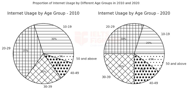
The two pie charts illustrate the proportion of internet users across five different age groups in 2010 and 2020.
Overall, young adults aged 20-29 remained the largest demographic of internet users, though their proportion declined over the decade. Meanwhile, internet usage among middle-aged and older adults increased significantly.
In 2010, people aged 20-29 accounted for the highest percentage of internet users, at 35%, followed closely by the 10-19 age group, which made up 30%. However, by 2020, these figures had dropped to 30% and 20%, respectively, indicating a decreasing dominance of younger users in internet usage.
Conversely, the percentage of internet users aged 30-39 increased from 20% in 2010 to 25% in 2020. A similar trend was observed in the 40-49 age group, which rose from 10% to 15%. The most significant increase, however, was among individuals aged 50 and above, whose proportion doubled from 5% in 2010 to 10% in 2020. These changes suggest that internet accessibility has expanded to a wider range of age groups over time.
Hai biểu đồ tròn minh họa tỷ lệ người sử dụng Internet theo năm nhóm tuổi khác nhau vào năm 2010 và 2020.
Nhìn chung, những người trẻ từ 20-29 tuổi vẫn là nhóm có tỷ lệ sử dụng Internet cao nhất, mặc dù tỷ lệ này đã giảm trong suốt thập kỷ. Trong khi đó, tỷ lệ người trung niên và cao tuổi sử dụng Internet tăng đáng kể.
Năm 2010, nhóm tuổi 20-29 chiếm tỷ lệ cao nhất với 35%, theo sau là nhóm 10-19 tuổi với 30%. Tuy nhiên, đến năm 2020, các con số này giảm xuống còn 30% và 20%, cho thấy sự suy giảm trong việc thống trị Internet của người trẻ tuổi.
Ngược lại, tỷ lệ người sử dụng Internet trong nhóm 30-39 tuổi tăng từ 20% năm 2010 lên 25% năm 2020. Xu hướng tương tự cũng được quan sát thấy ở nhóm 40-49 tuổi, với tỷ lệ tăng từ 10% lên 15%. Sự gia tăng đáng kể nhất thuộc về nhóm người từ 50 tuổi trở lên, khi tỷ lệ này tăng gấp đôi từ 5% lên 10% trong cùng kỳ. Những thay đổi này cho thấy khả năng tiếp cận Internet ngày càng mở rộng đến nhiều nhóm tuổi hơn theo thời gian.
Uncommon Words and Collocations
- Demographic(/ˌdɛməˈɡræfɪk/, noun): Nhóm nhân khẩu học
- Middle-aged(/ˈmɪd.l̩.eɪdʒd/, adjective): Trung niên
- Accessibility(/əkˌsɛsəˈbɪlɪti/, noun): Khả năng tiếp cận
- Internet penetration(/ˈɪntərˌnɛt ˌpɛnɪˈtreɪʃən/, noun phrase): Mức độ phổ biến của Internet
- Dominance(/ˈdɒmɪnəns/, noun): Sự thống trị
Bài mẫu 5:
Đề bài:
The charts show the proportion of students choosing different university majors in two different years.
Summarise the information by selecting and reporting the main features, and make comparisons where relevant.
- Outline (English)
| Introduction |
The two pie charts compare the percentage of students enrolling in five different university majors in 2010 and 2020. Hai biểu đồ tròn so sánh tỷ lệ sinh viên theo học năm ngành đại học khác nhau vào năm 2010 và 2020. |
| Overview |
Engineering remained the most popular major, with its proportion increasing over time. Kỹ thuật vẫn là ngành học phổ biến nhất và tỷ lệ sinh viên theo học ngành này tăng theo thời gian. |
| Body Paragraph 1 |
Discuss the increase in students choosing engineering and sciences. Thảo luận về sự gia tăng số lượng sinh viên chọn ngành kỹ thuật và khoa học. |
| Body Paragraph 2 |
Explain the decline in business and arts, while other majors remained stable. Giải thích sự suy giảm trong ngành kinh doanh và nghệ thuật, trong khi các ngành khác giữ nguyên. |
Sample Essay
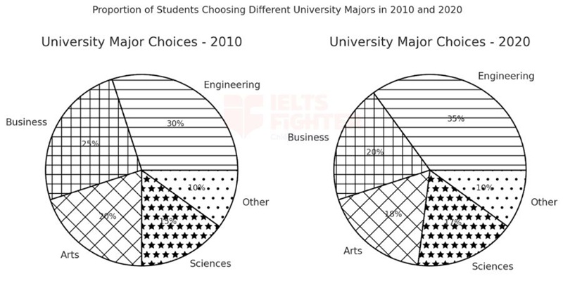
The two pie charts illustrate the proportion of students enrolling in five different university majors in 2010 and 2020.
Overall, engineering remained the most popular major, with an increase in student enrollment over the decade. Meanwhile, business and arts experienced a decline, whereas sciences showed a slight rise.
In 2010, engineering was the most chosen field, accounting for 30% of all students. By 2020, this figure had risen to 35%. Similarly, the proportion of students selecting sciences grew from 15% in 2010 to 17% in 2020.
On the other hand, the percentage of students pursuing business fell from 25% in 2010 to 20% in 2020, while arts also saw a decrease from 20% to 18%. Meanwhile, other majors remained unchanged at 10% in both years. These trends suggest a growing preference for technical and scientific fields over business and creative disciplines.
Hai biểu đồ tròn minh họa tỷ lệ sinh viên đăng ký vào năm ngành đại học khác nhau vào năm 2010 và 2020.
Nhìn chung, kỹ thuật vẫn là ngành học phổ biến nhất, với số lượng sinh viên theo học tăng lên trong suốt thập kỷ. Trong khi đó, ngành kinh doanh và nghệ thuật giảm, còn khoa học có mức tăng nhẹ.
Năm 2010, kỹ thuật là ngành được lựa chọn nhiều nhất, chiếm 30% tổng số sinh viên. Đến năm 2020, con số này đã tăng lên 35%. Tương tự, tỷ lệ sinh viên chọn ngành khoa học cũng tăng từ 15% vào năm 2010 lên 17% vào năm 2020.
Ngược lại, tỷ lệ sinh viên theo học ngành kinh doanh giảm từ 25% năm 2010 xuống còn 20% vào năm 2020, trong khi ngành nghệ thuật cũng giảm từ 20% xuống còn 18%. Trong khi đó, các ngành học khác giữ nguyên ở mức 10% trong cả hai năm. Những xu hướng này cho thấy sự ưu tiên ngày càng tăng đối với các ngành kỹ thuật và khoa học thay vì các lĩnh vực kinh doanh và sáng tạo.
Uncommon Words and Collocations
- University major(/ˈjuːnɪvɜːsɪti ˈmeɪdʒər/, noun): Ngành học đại học
- Enrollment(/ɪnˈroʊlmənt/, noun): Sự ghi danh, đăng ký học
- Technical fields(/ˈtɛknɪkəl fiːldz/, noun phrase): Các lĩnh vực kỹ thuật
- Creative disciplines(/kriˈeɪtɪv ˈdɪsɪplɪnz/, noun phrase): Các ngành sáng tạo
- Growing preference(/ˈɡroʊɪŋ ˈprɛfərəns/, noun phrase): Xu hướng ưa chuộng ngày càng tăng
Bài mẫu 6
The three pie charts below show the changes in annual spending by a particular UK school in 1981, 1991 and 2001.
| Introduction | The three pie charts illustrate the percentage distribution of total annual expenditure in a specific UK school in three different years: 1981, 1991, and 2001. |
| Overview |
+ increase: insurance, teacher 'salaries, furniture & equipment + decrease: resources, other workers 'salaries
+ Teacher 'salaries – highest proportion of spending
|
| Body Paragraph 1: Categories that increased |
+ Largest category in all years. + Increased from 40% in 1981 to 50% in 1991, then slightly declined to 45% in 2001.
+ Dropped from 15% in 1981 to 5% in 1991, but rose significantly to 23% in 2001. |
| Body Paragraph 2: Categories that decreased |
+ Decreased steadily from 28% (1981) to 22% (1991) and further to 15% (2001).
+ Initially increased from 15% (1981) to 20% (1991) but dropped sharply to 9% (2001). |
Sample:
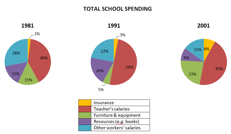
The three pie charts illustrate the percentage distribution of total annual expenditure in a specific UK school in three different years: 1981, 1991, and 2001.
Overall, teacher’s salaries consistently accounted for the largest portion of spending throughout the period. While the percentage of expenditure on furniture & equipment and insurance increased over time, spending on other workers’ salaries and educational resources showed a downward trend.
Teacher’s salaries were the most significant expenditure in all three years, rising from 40% in 1981 to 50% in 1991 before slightly declining to 45% in 2001. Despite the minor drop in the final year, this category remained the largest share of school spending.
Spending on furniture & equipment fluctuated. It initially decreased significantly from 15% in 1981 to just 5% in 1991. However, by 2001, it rose sharply to 23%, making it the second-largest category of expenditure in that year.Similarly, insurance, though the smallest category, experienced steady growth over time. It accounted for only 2% in 1981, increased marginally to 3% in 1991, and then quadrupled to 8% in 2001.
In contrast, spending on other workers' salaries showed a steady decline. This category made up 28% of total expenditure in 1981, fell to 22% in 1991, and dropped further to 15% in 2001. A similar pattern was observed in the spending on educational resources, such as books. The allocation for this category initially rose from 15% in 1981 to 20% in 1991 but then fell dramatically to just 9% in 2001.
Uncommon Words and Collocations
- illustrate /ˈɪləstreɪt/ (v): minh họa, mô tả bằng biểu đồ/số liệu
- percentage /pəˈsentɪdʒ/ (n): phần trăm
- distribution /ˌdɪstrɪˈbjuːʃən/ (n): sự phân bố, sự phân bổ
- percentage distribution /pəˈsentɪdʒ ˌdɪstrɪˈbjuːʃən/ (n phr): sự phân bố theo tỷ lệ phần trăm
- total /ˈtəʊtl/ (adj): tổng, toàn bộ
- annual /ˈænjuəl/ (adj): hằng năm
- expenditure /ɪkˈspendɪtʃə(r)/ (n): chi tiêu
- total annual expenditure /ˈtəʊtl ˈænjuəl ɪkˈspendɪtʃə(r)/ (n phr): tổng chi tiêu hằng năm
- specific /spəˈsɪfɪk/ (adj): cụ thể, xác định rõ
- illustrate /ˈɪləstreɪt/ (v): thể hiện (trong văn học thuật thay cho “show”)
Bài mẫu 7
The charts below show the qualifications of staff in an advertising company in 1990 and 2010. Summarise the information by selecting and reporting the main features, and make comparisons where relevant.
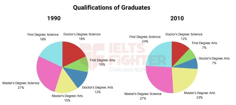
The two pie charts illustrate the academic qualifications of employees in an advertising firm in the years 1990 and 2010.
Overall, Master’s Degree in Science remained the most common qualification in both years. However, while the proportion of First Degrees in Science rose significantly by 2010, qualifications in the Arts, particularly at the doctoral level, declined.
In 1990, Master’s Degree in Science was the highest qualification held by 27% of the staff. Doctor’s Degree in Science followed at 18%, while the percentages for Master’s and Doctor’s Degrees in Arts were 15% and 12%, respectively. First Degree qualifications were less common, with only 18% in Science and 10% in Arts.
By 2010, the percentage of employees with a Master’s Degree in Science remained unchanged at 27%, whereas First Degree in Science saw a significant increase to 24%. Master’s Degree in
Arts also rose to 23%, while the figures for Doctor’s Degree in Arts fell to 7%. The percentage of staff with a Doctor's Degree in Science remained the same at 12%.
- illustrate /ˈɪləstreɪt/ (v): minh họa, thể hiện (trong biểu đồ)
-
academic qualifications /ˌækəˈdemɪk ˌkwɒlɪfɪˈkeɪʃənz/ (n phr): trình độ học vấn
-
employees /ˌemplɔɪˈiːz/ (n): nhân viên
-
advertising firm /ˈædvətaɪzɪŋ fɜːm/ (n phr): công ty quảng cáo
-
overall /ˌəʊvərˈɔːl/ (adv): nhìn chung, tổng thể
-
remained /rɪˈmeɪnd/ (v): vẫn duy trì
-
most common qualification /məʊst ˈkɒmən ˌkwɒlɪfɪˈkeɪʃən/ (n phr): trình độ phổ biến nhất
-
proportion /prəˈpɔːʃən/ (n): tỷ lệ
-
rose significantly /rəʊz sɪɡˈnɪfɪkəntli/ (v phr): tăng đáng kể
-
doctoral level /ˈdɒktərəl ˈlevəl/ (n phr): trình độ tiến sĩ
-
declined /dɪˈklaɪnd/ (v): giảm xuống
-
highest qualification held /ˈhaɪɪst ˌkwɒlɪfɪˈkeɪʃən held/ (phr): bằng cấp cao nhất đạt được
-
percentages /pəˈsentɪdʒɪz/ (n): các tỷ lệ phần trăm
-
respectively /rɪˈspektɪvli/ (adv): lần lượt
-
unchanged /ʌnˈtʃeɪndʒd/ (adj): không thay đổi
-
whereas /weərˈæz/ (conj): trong khi đó (liên từ học thuật)
-
saw a significant increase /sɔː ə sɪɡˈnɪfɪkənt ˈɪnkriːs/ (phr): chứng kiến sự tăng đáng kể
-
figures /ˈfɪɡəz/ (n): số liệu
-
fell /fel/ (v): giảm
Trên đây là list bài mẫu IELTS Writing Task 1 Pie Chart, các bạn tham khảo nhé. Còn gì thắc mắc hãy cmt bên dưới để thầy cô hỗ trợ nha.
Ngoài ra cùng xem thêm:
Tổng hợp bài mẫu IELTS WRITING - TASK 1
Luyện tập cách viết Writing Task 1 dạng Table