Luyện tập cách viết IELTS Writing Task 1 dạng Table
Bài học Writing Task 1 tiếp theo mà chúng ta cùng luyện tập là bài Table nhé! Các bạn đã biết cách viết Task 1 một bài Table hoàn chỉnh chưa? Hãy bắt đầu bài học nào!
Table - Bảng là dạng biểu đồ với 1 bảng có các số liệu theo một chủ đề nhưng khác địa điểm, thời gian, đối tượng cụ thể. Bài Task 1 dạng bảng thường sẽ yêu cầu tóm tắt thông tin chính của bảng đó và phân tích so sánh.
Thí sinh cần chọn lọc, báo cáo, phân tích các điểm nổi bật, so sánh số liệu để tóm tắt.
Yêu cầu đề bài thường là: “Summarize the information by selecting and reporting the main features, making comparisons where relevant”
Cách viết Writing Task 1 dạng bài Table
Các bạn cùng xem bài học qua video chi tiết dưới đây nhé:
Tương tự các bài Chart khác, Table cũng chia thành hai loại với các cách gọi là:
- Time graph/Dynamic charts: Bảng có sự thay đổi theo thời gian
- Comparison graph/ Static charts: Bảng không có sự thay đổi theo thời gian
Chúng ta cùng phân tích theo MSP, với các phần kiến thức về từ vựng, ngữ pháp cùng cách viết bài, luyện tập như video nhé. Bạn xem kỹ video để luyện tập.
Material
REVIEW LANGUAGE TO DESCRIBE TRENDS
a. X + V + adv + giới từ + số liệu + time
b. There + be + a/an + adj + N + giới từ + số liệu + in + chủ thể + time
c. X + saw + a/an +N + time
d. A/an + adj + N + was seen + in + chủ thể + time
e. Year + witnessed/saw + a/an + adj + N + giới từ + số liệu + in + chủ thể
Activity 1: Rewrite the Vietnamese sentences into English by the given structures.
1. Giá dầu tăng đều đặn từ $2 đến $7 vào năm 2012 đến 2015. (e)
=> ...
2. Giá cả đối với mặt hàng hoa quả tươi và rau củ giảm mạnh, đặc biệt là sau năm 1989. (c)
=> ...
3. Chỉ số giá tiêu dùng đã tăng đều đặn từ khoảng 60 vào năm 1979 tới hơn 200 vào năm 2009. (b)
=> ...
4. Tỉ lệ tử vong do bệnh ung thư ở Nhật Bản giảm đáng kể vào năm 2011(a)
=> ...
5. Có một sự tăng lên nhẹ trong khoản chi phí cho sách ở Pháp vào năm 2010. (d)
=> ...
Activity 2. Write the sentences using the given words.
1. 1990 – percentage – people – used the Internet – US- highest – 70% – while – the figure for the UK – lower – 55%
=> ...
2. The proportion – tourists – going to the Pavilion – witnessed – remarkable climb – nearly 50% - 1995, before – dramatically falling – 30% - 2010.
=> ...
3. number of restaurant jobs – witnessed – rapid rise – which – peaked – 1400 – 2004
=> ...
4. While – proportion – educational volunteers – fell – 17%, data – health care – fell- by only 1%.
=> ...
5. The percentage – automobile manufacturers’ total sales – Asia – exhibited – gradual fall, bottoming – 21% - 2010.
=> ...
Strategy
I. Dynamic Table
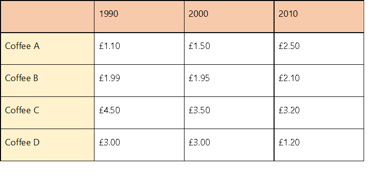
The table shows the price of four types of coffee in the UK from 1990 to 2010.
Activity 3: Write the introduction using the given hints
|
What |
the price of four types of coffee |
|
When |
From 1990 to 2010 |
|
Where |
The UK |
Then answer the following questions
1. Which brand was the most expensive throughout the period?
2. Which brand had the price that increased dramatically?
3. Which brand had the price that decreased by 2010?
4.Which brand had the stable price?
Activity 4: Write an overview for this table
|
OVERVIEW Needed information:
Useful structures:
Notes:
|
|
Body paragraphs of Dynamic table should be divided by:
+ Beginning – Mid point: Report data + Trend/Comparison e.g. The price of coffee A, which was at € 1.10 per cup in 1990, increased slightly to € 1.50 in 2000. + Mid-point – End: Report data + Trend/ Comparison e.g. Coffee C, which was the most expensive brand in 2000, at € 3.50, witnessed a small drop in price, ending at € 3.20 in 2010. |
II. Static Table
Activity 5: Complete the information below.
1.All four car companies invested a lot of money in ………… advertisements.
2.…………………. spent the largest budget in advertising campaigns.
3.……………….. was the least favored kind of advertisement.
4. 4 companies allocated the same amount money to ……………………
|
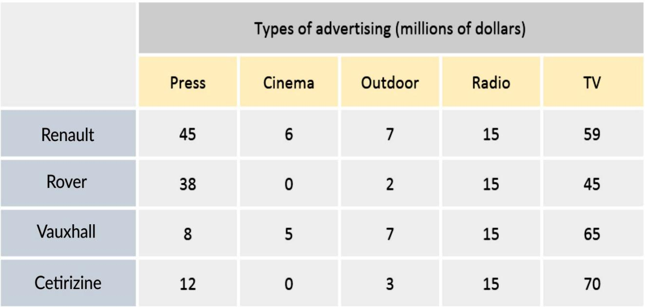
OVERVIEW Needed information: - Order (highest/lowest, vertical, horizontal) Note: Use the language for comparison e.g. Petroleum products were the least – favored fuel type in Asian countries, except for Thailand. BODY PARAGRAPHS Body paragraphs could be divided: - By row: Report data + Comparison E.g. In terms of press advertising, the expenditure of Renault stood at $ 45 million dollars, which was nearly 6 times higher than the figure for Vaux. - By column: Report data + Comparison HOW TO GROUP DATA - Highest & the second highest data: e.g. In terms of TV advertisement, the expenditure of Certirizine stood at 70 million, followed by 65 million of Vauxhall. - The equal data: e.g. The budget for Radio advertising was equal for all 4 brands, at 15 million each. - Folded data: (2/3/4 times) e.g. In terms of Press advertising, Renault surpassed the figure for Vauxhall by nearly 6 times, at 45 million and 8 million respectively. - Approximate data: e.g. The data for A and B were approximately the same, at 5 million and 5.5 million, respectively. |
Practice
The table shows the proportions of pupils attending four secondary school types between 2000 and 2009.
Summarise the information by selecting and reporting the main features, and make comparisons where relevant.
|
Secondary School Attendance |
|||
|
|
2000 |
2005 |
2009 |
|
Specialist Schools |
12% |
11% |
10% |
|
Grammar Schools |
24% |
19% |
12% |
|
Voluntary-controlled Schools |
52% |
38% |
20% |
|
Community Schools |
12% |
32% |
58% |
Overview
1. Order
-___________________ became the most popular kind of secondary school.
2. Trend:
-___________________ experienced a marked increase.
-___________ saw a corresponding decline.
Body 1: Downward trend
-The percentage – pupils – voluntary-controlled schools – fall – from over half to only 20% – from 2000 to 2009.
-The number – children – grammar schools – one quarter – drop by half – the same period.
Body 2: Upward trend
-While the other types of school – decline – in importance, the community schools – increase.
-Whereas – 12% – educate – in community schools – in 2000, this figure – increase – half of all pupils – during the following nine years.
Luyện tập phân tích dạng bài Table
Các bạn có thể xem nhiều hơn tại: Tổng hợp bài mẫu Writing Table
Chúng ta có một bài Table như sau:
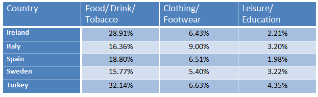
The table below gives information on consumer spending on different items in five different countries in 2002.
Summarise the information by selecting and reporting the main features, and make comparisons where relevant.
Write at least 150 words.
Percentage of national consumer expenditure by category – 2002
Chúng ta cùng phân tích và thực hiện làm bài như sau:
Introduction:
|
Đề bài |
Paraphrase |
|
|
The table below gives information on consumer spending on different items in five different countries in 2002 |
1. gives information on
|
|
|
2. consumer spending |
|
|
|
3. different items
|
|
|
|
4. five different countries in 2002 |
|
|
|
-> The given data represents the amount spent by consumers in Ireland, Italy, Spain, Sweden and Turkey in three categories in the year 2002.
|
||
Overview:
|
Ý tưởng |
Viết câu |
|
Dân cư tại các quốc gia trong biểu đồ tiêu nhiều vào đồ ăn và thuốc lá hơn là trang phục, giáo dục hay giải trí. |
In general, people of those countries spent more on food and tobaccos than they did for dresses, education and entertainment.
|
Body:
|
Đoạn |
Gợi ý |
Ý tưởng |
Viết câu |
|
1 |
Mô tả và so sánh hai cột số liệu về Food/Drink/Tobacco và Clothing/Footwear |
Người dân Turkey tiêu nhiều tiền nhất vào Food/Drink/Tobacco, chiếm đến 1/3 tổng chi tiêu các mặt hàng |
Turk people spent the highest percentage of food and tobaccos amounting one-third of their total expenses on consumer products. |
|
Người Ireland tiêu 28% thu nhập vào Food/Drink/Tobacco, trong khi người dân ở các quốc gia như Italy, Spain và Sweden chỉ tiêu dưới 15% cho các mặt hàng này. |
Irish people spent more than 28% on this category while people of Italy, Spain and Sweden spent just nearly a fifth (15%) for food and tobaccos. |
||
|
|
|
Về mặt hàng Clothing/Footwear, người Ý tiêu nhiều tiền nhất trong tổng số 5 nước, gấp 1.5 lần các nước khác. |
è The amount of money Italian spend on Clothing/Footwear ranked the 1st place in comparison with the expenditure in other countries. è The expenditure on Clothing/Footwear of the Italian was 1.5 times higher than that of other countries. |
|
2 |
Mô tả và so sánh hai cột số liệu về Leisure/Education và Clothing/Footwear |
Chi phí cho Leisure/Education là thấp nhất trong tổng số các danh mục |
è The expenditure in leisure activities and education was much less than the amount spent on food, tobacco and dresses.
|
|
Người dân tại Turkey tiêu nhiều nhất cho danh mục Leisure/Education trong khi người dân ở Spain là những người tiêu ít nhất cho lĩnh vực này |
The highest amount spent on education and entertainment was done by Turkish people (4.35%) and the least amount spent by was in Spain (1.98%). |
Cấu trúc:
|
Chiếm |
amount account for make up constitute |
|
28% |
More than a quarter |
|
15% |
Less than/Nearly a fifth |
|
Chiếm vị trí đứng đầu |
Rank/Take the 1st place Stand at the 1st place |
|
Gấp 1.5 lần |
1.5 times as much as higher than |
Bài mẫu:
The given data represents the amount of money spent by consumers in Ireland, Italy, Spain, Sweden and Turkey in three categories in the year 2002. As presented in the table data, people of those countries spent more on foods and tobaccos than they did for dresses, education and entertainment.
According to the given data, Turk people spent the highest percentage of food and tobaccos amounting one-third of their total expenses on consumer products. Irish people spent more than 28% on this category while people of Italy, Spain and Sweden spent just over 15% for food and tobaccos. For clothing and footwear, the people of these five countries spent around 5% to 9% of which Italian spent the highest percentage (9%).
Interestingly, the expenditure in leisure activities and education was much less than the amount spent on food, tobacco and dresses. The highest amount spent on education and entertainment was done by Turkish people (4.35%) and the least amount spent by the Spainish (1.98%).
Bài mẫu tham khảo thêm
Bài 1:
You should spend about 20 minutes on this task.
The Table below shows the results of a survey that asked 6800 Scottish adults (aged 16 years and over) whether they had taken part in different cultural activities in the past 12 months.
Summarise the information by selecting and reporting the main features, and make comparisons where relevant.
Write at least 150 words.
|
Participation in cultural activities, by age |
||||
|
16-24 |
25-44 |
45-74 |
All aged 16 and over |
|
|
|
% |
% |
% |
% |
|
Any performance* |
35 |
22 |
17 |
22 |
|
Undertaking any crafts |
11 |
17 |
22 |
19 |
|
Cultural purchases |
11 |
17 |
18 |
16 |
|
Any visual arts |
30 |
16 |
11 |
15 |
|
Any writing |
17 |
6 |
5 |
7 |
|
Computer based |
10 |
9 |
5 |
6 |
|
* Dancing, singing, playing musical instruments and acting |
||||
Bài mẫu:
The table shows details of participation in a variety of cultural activities over a year, according to the age of the participants.
Overall, any performance, which includes dancing, singing, playing musical instruments and acting, had the highest level of participation, with 22% of respondents participating in the previous 12 months. By contrast, computer based activities had the lowest level of participation (6 per cent).
People aged between 45 and 74 years old were most likely to undertake any activity to do with crafts (22 per cent), while performances were more likely to be participated in by those aged 16 to 24 (35 per cent). The differences between age groups were particularly marked in the case of visual arts and writing categories, where participation rates were around three times higher for younger people than for the older ones. It is clear from the evidence that age plays a significant role in the popularity of the cultural activities listed.
Bài 2
You should spend about 20 minutes on this task.
The table below shows the proportion of different categories of families living in poverty in Australia in 1999.
Summarise the information by selecting and reporting the main features, and make comparisons where relevant.
You should write at least 150 words.
|
Family type |
Proportion of people from each household type living in poverty |
|
single aged person |
6% (54,000) |
Bài mẫu:
The table gives a breakdown of the different type of family who were living in poverty in Australia in 1999.
On average, 11% of all households, comprising almost two million people, were in this position. However, those consisting of only one parent or a single adult had almost doubt this proportion of poor people, with 21% and 19% respectively.
Couples generally tended to be better off, with lower poverty levels for couples without children (7%) than those with children (12%). It is noticeable that for both types of household with children, a higher than average proportion were living in poverty at this time.
Older people were generally less likely to be poor, though once again the trend favoured eldery couples (only 4%) rather than single elderly people (6%).
Overall the table suggests that households of single adults and those with children were more likely to be living in poverty than those consisting of couples.
Các bạn cùng tham khảo và luyện nha. Bên cạnh đó, cùng luyện tập lại các bài cùng chuyên mục nha.
Các cấu trúc Writing Task 1 mô tả xu hướng và sự thay đổi của dữ liệu