Cách viết IELTS Writing Task 1 Pie Chart
Bài học Writing Task 1 hôm nay chúng ta tìm hiểu về dạng bài Pie Chart nhé. Đây là một trong những dạng bài hay gặp trong Writing nha. Các bạn hãy bắt đầu bài học bằng cách xem video từ đầu đến cuối nha.
Pie Chart là gì?
Pie chart, hay còn gọi là biểu đồ tròn, là biểu đồ thể hiện tỷ trọng của một hạng mục so với tổng số. Một đặc trưng của dạng Pie chart là tổng số liệu của tất cả các hạng mục trong một Pie chart luôn là 100%.
Biểu đồ chia thành các phần khác nhau, được minh họa theo hình tròn. Các phần minh họa cho tỷ lệ số trong đó độ dài cung của mỗi khu vực sẽ đại diện tỷ lệ số riêng, tỷ lệ thuận với số lượng mà nó đại diện. Tỷ lệ ở đây thường là phần trăm nhưng cũng có thể là số liệu khác.
Các loại biểu đồ tròn:
Có hai dạng Pie Chart là:
- Pie chart with timeline /Time graph/Dynamic charts: Biểu đồ có sự thay đổi theo thời gian
- Pie chart without timeline/Comparison graph/ Static charts: Biểu đồ không có sự thay đổi theo thời gian
Ví dụ đây là một đề thi thật nhé:
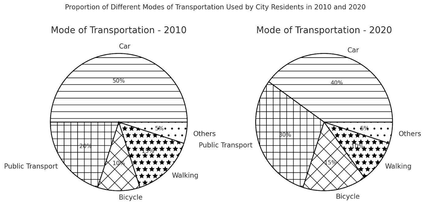
The charts show the proportion of different modes of transportation used by city residents in 2010 and 2020.
Summarise the information by selecting and reporting the main features, and make comparisons where relevant.
Viết bài Writing Task 1 Pie Chart thế nào?
Dưới đây là video hướng dẫn viết bài piechart, bạn click xem nhé:
Để bắt đầu viết bài Pie Chart, bạn cần lưu ý những điều dưới đây. Phần này đã được IELTS Fighter chia sẻ trong bài tổng về Hướng dẫn viết IELTS Writing Task 1 rồi, bạn có thể click để xem cách viết theo dạng bài khác nữa nhé.
Như đã giới thiệu, biểu đồ có hai dạng là 1 hình tròn và nhiều hình tròn.
Với biểu đồ 1 hình tròn thì khá dễ, lượng thông tin không nhiều và phân tích một biểu đồ sẽ cần:
- Phân tích và mô tả các phần theo biểu đồ
- So sánh các phần đó, chú ý đến tỷ lệ nhiều nhất, nhiều hơn, ít hơn...
Đối với dạng nhiều hình tròn, điều quan trọng là chú ý về thời gian.
Biểu đồ theo thời gian thì sẽ chủ yếu mô tả về xu hướng, từ vựng và cấu trúc mô tả tăng/giảm hay đạt mốc cao, thấp...
Biểu đồ không theo thời gian thì sẽ không có sự so sánh giữa các khoảng thời gian. Vì thế cần miêu tả thông tin trên từng chart sau đó liên hệ so sánh với nhau. Thường sẽ là so sánh sự giống/khác của các phần trong biểu đồ.
Language to describe statistics
|
Percentage |
Fraction |
|
80% |
Four-fifths |
|
75% |
Three –quarters |
|
60% |
Three - fifths |
|
50% |
Half |
|
40% |
Two - fifths |
|
25% |
A quarter |
|
20% |
A fifth |
|
10%i |
One in ten |
Ngoài ra, các bạn thí sinh có thể sử dụng những phó từ chỉ sự ước lượng để biến đổi tỉ lệ phần trăm sang phân số gần với những tỉ lệ được nêu ở bảng trên.
|
Percentage |
Fraction |
|
77% |
Just over three quarters |
|
52% |
Approximately half |
|
49% |
Just under/ neatly a half |
|
32% |
Almost a third |
|
19% |
Nearly a fifth |
|
Verb |
Meaning |
|
Account for/take up/make up/ consist of/comprise/constitute |
X chiếm (đóng góp) bao nhiêu % |
|
Account for a bigger (or smaller) share Make up a bigger (or smaller) proportion |
Có nhiều hơn/ít hơn thị phần/tỉ lệ so với cái khác |
|
Take up the remaining X |
Chiếm bao nhiêu phần trăm còn lại |
Comparison structures
|
Types of conparison |
Structure |
Example |
|
Comparative |
S + V + more/less + adjective/adverb + than + N |
The birth rate in 2000 was higher than that in 1999 The number of tourists visiting France was significantly higher than in Italy.
|
|
Superlative |
S + V + the + superlative adjective +N
|
The USA had the highest unemployment rate in 2010. Japan was the most popular travel destination in Asia.
|
|
Multiplicative |
+ S + V + Twice/three times/four times + as + many/much + as + N
|
The number of students in 2020 was twice as many as that in 2010. The revenue of company A was three times higher than that of company B. |
|
Relative |
A + stood at/be + số liệu + compared to / in comparison with + số liệu của B
|
In 2010, the percentage of female employees stood at 80% compared to/ in comparison with 20% male ones
|
Cấu trúc viết bài Pie Chart như thế nào?
Chúng ta có thể viết bài theo cấu trúc chung cho Task 1 nhưng phân tích kỹ hơn để trả lời đúng yêu cầu đề bài. Đây là cấu trúc chung tham khảo:
- Introduction: 1 sentence. Ở mở đầu bạn có thể paraphrase lại câu hỏi
- Overview: 1-2 sentences. Phần này nêu tổng quan, phân tích chung overview
- Body paragraph 1: 3-4 sentences. Ở body, thực hiện phân tích report data, describe trends/changes, make comparisons
- Body paragraph 2: 3-4 sentences. Tương tự thực hiện phân tích report data, describe trends/changes, make comparisons
- Conclusion (nếu muốn): 1-2 sentence. Viết câu kết luận, tổng kết.
Riêng với từng dạng biểu đồ tròn, chúng ta cùng luyện tập theo phân tích cụ thể của 2 phần dưới đây.
Luyện tập viết biểu đồ tròn
Static Pie charts - Biểu đồ không có sự thay đổi theo thời gian
Đề bài:
The pie charts below show the average household expenditures in Japan and Malaysia in the year 2010.
Summarize the information by selecting and reporting the main features, and make comparisons where relevant
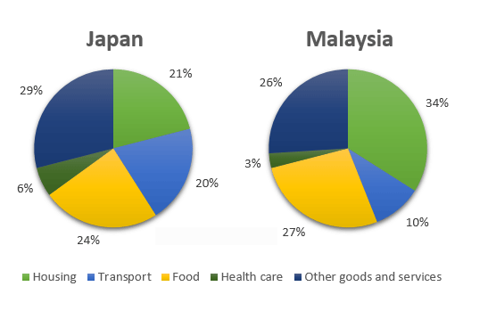
| Introduction | The charts illustrate the proportion of spending on different goods and services of households in two different countries in 2010. |
|
Overview Needed information: Order (highest/lowest) Note: Use the language for comparison |
Overall, it is clear that families in both countries spent the largest proportion of their income on Housing and Food, while Healthcare was the service receiving the lowest share of expenditure. |
|
Body There are 2 ways to divide the body paragraphs: -1st approach: Describe each pie in each paragraph + 1st Pie: Report + Compare data among categories e.g. The proportion of spending on Housing was highest in Malaysia, at 34%. + 2nd Pie: Report data + Compare data among categories e.g. Food registered the highest data in Japan, at 24%.
e.g. The proportion of spending on Housing was highest in Malaysia, at 34% while Japanese families allocated just 21% of their budget for this category. NOTE: Only use the language for comparison |
Body 1: Food + Housing The proportion of spending on Housing was highest in Malaysia, at 34% while Japanese families allocated just 21% of their budget for this category. In terms of food, the figures for both nations were similar, at 24% and 27% for Malaysia and Japan respectively. Body 2: Transport + Healthcare + Others - Transport: accounted for – a fifth – in Japan – twice as much as – the figure – Regarding the remaining categories, Transport accounted for exactly a fifth of total expenditure in Japan, twice as much as the figure for Malaysia. Healthcare received the least amount of money in two countries while the percentage of money spent on Other goods and services were quite significant, at over a quarter in each country. |
Dynamic chart Biểu đồ có sự thay đổi theo thời gian
The three pie charts below show the changes in annual spending by local authorities in Someland in 1980, 1990 and 2000.
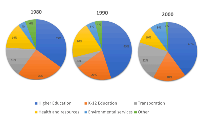
| Introduction | The given pie charts give information on how the policy makers in Someland allocated their budget to various expenses on a yearly basis over the period of two decades starting from 1980. |
|
Overview Note: Use the language for trend & comparison |
Overall, it can be easily seen that the proportion of public fundings spent on three sectors namely tertiary education, transport infrastructure and services serving the environmental purposes witnessed an upward trend over the period shown while the opposite was true for the other three remaining sectors. Besides, in all three years, the highest level of public spending belonged to development of the teaching and learning at universities, in contrast to the negligible expenditure for unspecified costs, labeled “other”. |
|
Body There are 2 ways to divide the body paragraphs: -1st approach: By time: Each body paragraph describes each year + 1st Pie: Report + Compare data among categories e.g. In 1980, the percentage of public spendings in Higher education was over 8 times higher than the data for environmental services, at 35% and 4%, respectively. + 2nd Pie: Report data + Describe trend e.g. In 1990, there was a dramatic growth of 10% to reach 45% in university education’s fundings. - 2nd approach: By category: Upward/ Downward trend + Paragraph 1: Report data + Trend/ Comparison + Paragraph 2: Report data + Trend/ Comparison e.g. Regarding the areas that experienced a growth in importance, university education constituted more than one third of the total governmental outgoings in 1980 and the following two decades saw a five-percent increase, with a peak of 45 percent in 1990. |
Cách 1: In 1980, the largest proportion of the budget was allocated to higher education, at 35%, followed by K-12 education at 25%. Transportation and health and human resources accounted for 16% and 14% respectively. Environmental services and other sectors made up relatively small shares, at 4% and 6%. By 1990, spending on higher education had risen markedly to 45%, consolidating its dominant position. Health and human resources also increased to 20%. In contrast, K-12 education fell to 20%, while transportation dropped sharply to 6%. Environmental services saw a slight increase to 5%, whereas other spending decreased to 4%.
Cách 2: In terms of rising trends, the proportion of funding for higher education grew significantly from 35% in 1980 to 45% in 1990, before falling slightly to 40% in 2000, which was still 5 percentage points higher than the initial figure. Transportation also experienced a marked increase overall. After dropping sharply from 16% in 1980 to 6% in 1990, it rose dramatically to 22% in 2000, making it the second-largest expenditure category by the end of the period. Similarly, environmental services saw a steady increase, climbing from 4% in 1980 to 5% in 1990 and then to 9% in 2000. By contrast, several sectors witnessed downward trends. Spending on K-12 education declined gradually from 25% in 1980 to 20% in 1990 and further to 18% in 2000. Health and human resources followed a similar pattern, increasing from 14% to 20% between 1980 and 1990, but then falling sharply to 10% in 2000, resulting in an overall decrease compared to the starting point. The proportion allocated to other services fell steadily throughout the period, from 6% in 1980 to 4% in 1990 and reaching just 1% in 2000, the smallest share among all categories. |
Bây giờ bạn thử phân tích và luyện viết theo đề sau nhé:
The three pie charts below show the changes in annual spending by a particular UK school in 1981, 1991 and 2001.
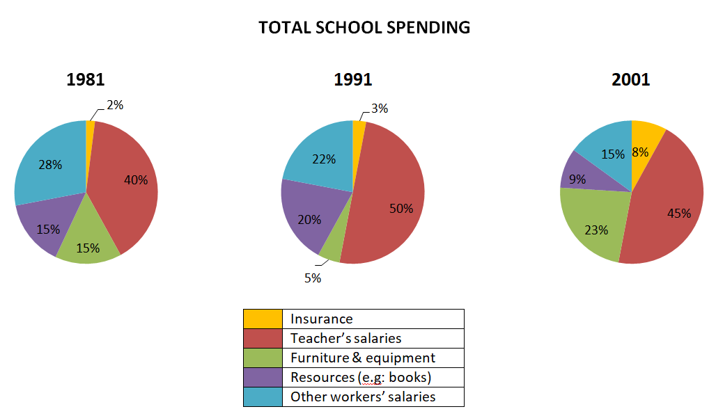
Introduction
Overview
Overview
- Trend:
+ increase: insurance, teacher 'salaries, furniture & equipment
+ decrease: resources, other workers 'salaries
- Order
+ Teacher 'salaries – highest proportion of spending
Body Paragraph 1: Categories that increased
- Teacher’s salaries:
+ Largest category in all years.
+ Increased from 40% in 1981 to 50% in 1991, then slightly declined to 45% in 2001.
- Furniture & equipment:
+ Dropped from 15% in 1981 to 5% in 1991, but rose significantly to 23% in 2001.
Body Paragraph 2: Categories that decreased
- Other workers' salaries:
+ Decreased steadily from 28% (1981) to 22% (1991) and further to 15% (2001).
- Resources (e.g., books):
+ Initially increased from 15% (1981) to 20% (1991) but dropped sharply to 9% (2001).
Bài mẫu Pie Chart
Chúng ta luyện thêm với một số đề và bài mẫu nhé.
Tuyển tập sample, bạn click bộ bài mẫu Writing Task 1 Pie Chart để tải thêm nha.
Bài phân tích cho đề ví dụ đầu tiên ở trên nhé.
Outline
| Introduction |
The two pie charts compare the percentage of city residents using five different modes of transportation in 2010 and 2020. Hai biểu đồ tròn so sánh tỷ lệ cư dân thành phố sử dụng năm phương tiện di chuyển khác nhau vào năm 2010 và 2020. |
| Overview |
Cars remained the most popular mode of transport in both years, though their proportion decreased. Ô tô vẫn là phương tiện phổ biến nhất trong cả hai năm, nhưng tỷ lệ sử dụng đã giảm. |
| Body Paragraph 1 |
Discuss the decline in car usage and walking. Thảo luận về sự suy giảm của việc sử dụng ô tô và đi bộ. |
| Body Paragraph 2 |
Explain the increase in public transport and bicycle usage, while the percentage of people using other modes remained unchanged. Giải thích sự gia tăng của phương tiện công cộng và xe đạp, trong khi tỷ lệ sử dụng các phương tiện khác không thay đổi. |
Sample Essay
The two pie charts illustrate the proportion of city residents using five different types of transportation in 2010 and 2020.
Overall, cars remained the dominant mode of transport, but their proportion declined. Meanwhile, the percentage of people using public transport and bicycles increased, while walking became a less common means of travel.
In 2010, cars accounted for 50% of all transportation usage, but this figure dropped to 40% in 2020. Similarly, the proportion of people walking decreased from 15% to 10%. Meanwhile, the percentage of residents using other modes of transport remained unchanged at 5% in both years.
On the other hand, public transport and bicycles gained popularity over the decade. The proportion of city residents relying on public transport increased from 20% in 2010 to 30% in 2020, while bicycle usage grew from 10% to 15%. These trends indicate a shift towards more environmentally friendly modes of transportation.
Hai biểu đồ tròn minh họa tỷ lệ cư dân thành phố sử dụng năm loại phương tiện giao thông khác nhau vào năm 2010 và 2020.
Nhìn chung, ô tô vẫn là phương tiện di chuyển chủ yếu, nhưng tỷ lệ sử dụng đã giảm. Đồng thời, số người sử dụng phương tiện công cộng và xe đạp tăng lên, trong khi đi bộ trở nên ít phổ biến hơn.
Vào năm 2010, ô tô chiếm 50% tổng số phương tiện được sử dụng, nhưng con số này giảm xuống còn 40% vào năm 2020. Tương tự, tỷ lệ người đi bộ cũng giảm từ 15% xuống còn 10%. Trong khi đó, tỷ lệ cư dân sử dụng các phương tiện khác vẫn giữ nguyên ở mức 5% trong cả hai năm.
Mặt khác, phương tiện công cộng và xe đạp trở nên phổ biến hơn theo thời gian. Tỷ lệ người dân sử dụng phương tiện công cộng tăng từ 20% vào năm 2010 lên 30% vào năm 2020, trong khi tỷ lệ sử dụng xe đạp tăng từ 10% lên 15%. Những xu hướng này cho thấy sự dịch chuyển sang các phương tiện thân thiện với môi trường hơn.
Uncommon Words and Collocations
- Mode of transport(/məʊd əv ˈtrænspɔːt/, noun): Phương tiện di chuyển
- Dominant(/ˈdɒmɪnənt/, adjective): Chiếm ưu thế
- Environmentally friendly(/ɪnˌvaɪrənˈmɛntəli ˈfrɛndli/, adjective): Thân thiện với môi trường
- Proportion(/prəˈpɔːʃən/, noun): Tỷ lệ
- Shift towards(/ʃɪft təˈwɔːdz/, verb phrase): Xu hướng chuyển sang
Tiếp tục thêm một đề và video hướng dẫn dưới đây:
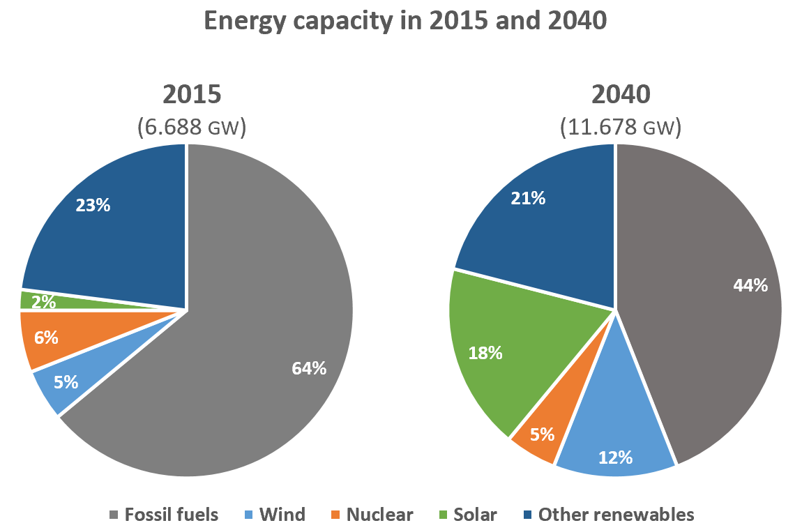
The pie charts below compare the proportion of energy capacity in gigawatts (GW) in 2015 with the predictions for 2040.
Summarize the information by selecting and reporting the main features, and make comparisons where relevant.
Write at least 150 words.
Analysis:
|
Loại biểu đồ |
pie chart |
|
Nội dung |
proportion/percentage of energy capacity |
|
Thời gian |
2015-2040 -> quá khứ đơn, hiện tại, tương lai |
|
Đơn vị |
GW, %, percent |
|
Đối tượng |
fossil fuels, wind, nuclear, solar, and other renewables |
Brainstorm:
|
Introduction |
the pie charts depict/show/illustrate the percentage of energy capacity 2015 / and projections for 2040 |
|
Overview |
- projected energy capacity nearly doubles from … to … - fossil fuels remain the main/ major energy source - significant rise in solar and wind |
|
Body 1 |
Viết về sự thay đổi của fossil fuels and other renewables - highest proportion, at … - a decline by …% - a slight fall/drop (from … to…) |
|
Body 2 |
Viết về solar, wind, và nuclear energy - a dramatic rise in solar and wind (from…to) - a slight decrease, from … to |
Essay:
The pie charts below depict the percentage of energy capacity in 2015 with the projections for 2040.
Overall, it can be seen that the projected capacity almost doubles from 6.688 GW to 11.678 GW. The most noticeable feature from the chart is that fossil fuel, despite its decrease in the proportion of energy capacity, will remain a major energy source in 2040. Moreover, the significant rise in solar and wind energy capacity should not be overlooked.
In 2015, the proportion of energy capacity from fossil fuels was the highest, at 64%. However, this figure is projected to fall by 20% at the end of the period. In addition, the percentage of other renewables stood at 23% in 2015 and it will have a slight drop to 21% over the next 25 years.
In contrast, both wind and solar energy are predicted to witness a dramatic rise in the proportion of energy capacity. To be more specific, the figure for solar energy has a jump from 2% in 2015 to 18% in 2040 and that for wind will increase more than twofold, from 5% to 12%. Regarding nuclear energy, the projected proportion will be 5% in 2040, a slight decline from 6% in 2015.
Words: 205
Vocabulary and Collocations:
|
the most noticeable feature |
đặc điểm dễ dàng nhận ra nhất là |
|
should not be overlooked |
không nên bị bỏ qua |
|
to be projected/predicted + to V-inf |
dự đoán, được dự đoán rằng là |
|
twofold (n) |
gấp 2 lần |
|
regarding sth |
về phần |
Hy vọng với những bài viết trên đã giúp bạn nâng cao kỹ năng Viết bài Writing task 1 Pie Chart. Cùng luyện tập hàng ngày để nâng band điểm nhé.
Xem thêm: