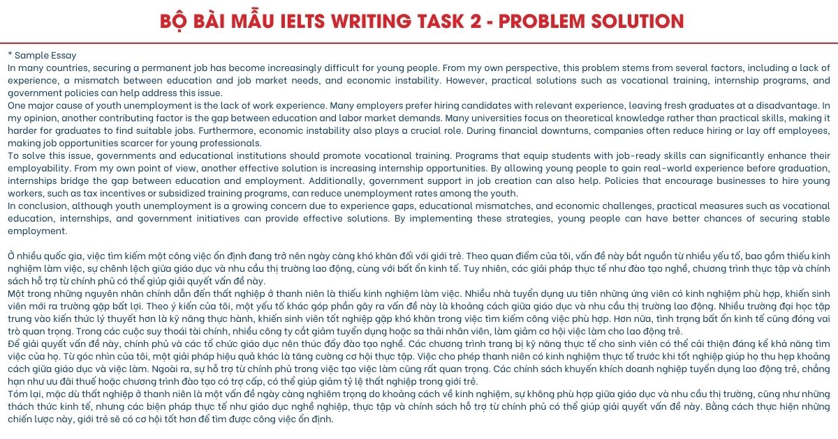
Tổng hợp bài mẫu IELTS Writing Task 1 Mixed Chart (Multiple Charts)
Mixed chart được đánh giá khó khi không chỉ phải phân tích một mà tận hơn 2 biểu đồ. Tuy nhiên, đây là dạng bài mà hiểu, phân tích sẽ tìm được hướng viết tốt, đảm bảo các tiêu chí chấm điểm và đạt điểm cao hơn. Hôm nay cùng phân tích các đề bài và bài mẫu, từ vựng để thêm ý tưởng, vốn từ sử dụng cho bài thi của mình nhé.
Trước khi tham khảo bài mẫu, chúng ta cùng điểm lại thông tin về Mixed Chart (Multiple Charts) và cấu trúc viết bài cơ bản nhé.
Cách viết bài Mixed Chart
Trong bài tổng quan và hướng dẫn viết Writing Task 1 chi tiết, cô đã nhắc tới dạng biểu đồ kết hợp là ghép từ 2 chart trở lên (có thể là cùng dạng hoặc khác). Với dạng này, người học cần chọn lọc thông tin phù hợp, phân tích, so sánh số liệu, sự giống khác của những biểu đồ được ra.
Vì phải phân tích 2 biểu đồ nên thí sinh thường thấy khó khăn nhưng việc định hướng, chọn thông tin tương đồng, phân tích so sánh theo thông tin chính sẽ giúp bạn làm bài tốt hơn. Dạng Mixed Chart phổ biến là sự kết hợp:
Các dạng bài Mixed Charts thường gặp
- Table (bảng biểu) với pie chart (biểu đồ tròn)
- Table (bảng biểu) với line chart (biểu đồ đường)
- Table (bảng biểu) với bar chart (biểu đồ cột)
- Pie chart (biểu đồ tròn) với line chart (biểu đồ đường)
- Pie chart (biểu đồ tròn) với bar chart (biểu đồ cột)
- Line chart (biểu đồ đường) với bar chart (biểu đồ cột)
Cấu trúc viết Mixed Chart cũng tương tự như dạng khác, chỉ là góc phân tích khác thôi. Vì thế bạn có thể viết theo cấu trúc cơ bản như sau:
- Introduction: 1 sentence. Ở mở đầu bạn có thể paraphrase lại câu hỏi
- Overview: 1-2 sentences. Phần này nêu tổng quan, phân tích chung overview
- Body paragraph 1: 3-4 sentences. Ở body, thực hiện phân tích report data, describe trends/changes, make comparisons
- Body paragraph 2: 3-4 sentences. Tương tự thực hiện phân tích report data, describe trends/changes, make comparisons
- Conclusion (nếu muốn): 1 sentence. Viết câu kết luận, tổng kết.
Chi tiết luyện tập, bạn xem bài trước: Hướng dẫn viết bài Task 1 Mixed Chart có video kèm theo nhé.
Bài mẫu Multiple Charts
Sample 1
Đề bài:
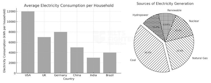
The bar chart illustrates the average electricity consumption per household in different countries, while the pie chart shows the percentage of electricity generation by source.
Summarise the information by selecting and reporting the main features, and make comparisons where relevant.
1. Outline
Introduction:
The bar chart compares the average electricity consumption per household across six countries while the pie chart presents the proportion of electricity generated from different sources.
Biểu đồ cột so sánh mức tiêu thụ điện trung bình của mỗi hộ gia đình tại sáu quốc gia, trong khi biểu đồ tròn thể hiện tỷ lệ sản xuất điện từ các nguồn khác nhau.
Overview:
The USA has the highest electricity consumption per household, while India records the lowest.
Coal is the dominant source of electricity generation, whereas renewable energy contributes the least.
Than đá là nguồn sản xuất điện chính, trong khi năng lượng tái tạo đóng góp ít nhất.
Mỹ có mức tiêu thụ điện cao nhất trên mỗi hộ gia đình, trong khi Ấn Độ có mức thấp nhất.
Body Paragraph 1:
Explain the variations in electricity consumption among countries, emphasizing the stark contrast between developed and developing nations.
Giải thích sự khác biệt trong mức tiêu thụ điện giữa các quốc gia, nhấn mạnh sự tương phản rõ rệt giữa các nước phát triển và đang phát triển.
Body Paragraph 2:
Describe the heavy reliance on coal and natural gas for electricity generation, with renewable and hydropower playing minor roles.
Mô tả sự phụ thuộc lớn vào than đá và khí tự nhiên để sản xuất điện, cùng với vai trò nhỏ của năng lượng tái tạo và thủy điện.
2. Sample Essay
The bar chart compares the average electricity consumption per household across six countrieswhilethe pie chart presents the proportion of electricity generated from different sources.
Overall, electricity consumption per household varies significantly, with the USA using the most power and India the least. Meanwhile, coal accounts for the largest share of electricity production, while renewable energy contributes the least.
In terms of electricity consumption, the USA leads with an average household usage of 12,000 kWh per year, followed by Germany (8,000 kWh) and the UK (7,000 kWh). In contrast, developing countries such as China, India, and Brazil consume significantly less, with India recording the lowest figure at 3,000 kWh per household. These trends suggest that developed nations have a much higher electricity demand due to advanced infrastructure and greater reliance on electrical appliances.
Coal is the dominant source of electricity, making up 40% of total generation, followed by natural gas at 25%. Nuclear energy accounts for 15%, while renewable sources and hydropower contribute 10% each. This indicates a continued reliance on fossil fuels, with only a small portion of electricity coming from sustainable energy sources.
Biểu đồ cột so sánh mức tiêu thụ điện trung bình của mỗi hộ gia đình tại sáu quốc gia, trong khi biểu đồ tròn thể hiện tỷ lệ sản xuất điện từ các nguồn khác nhau.
Nhìn chung, mức tiêu thụ điện của các hộ gia đình có sự chênh lệch đáng kể, với Mỹ có mức tiêu thụ cao nhất và Ấn Độ thấp nhất. Trong khi đó, than đá chiếm tỷ lệ lớn nhất trong sản xuất điện, trong khi năng lượng tái tạo đóng góp ít nhất.
Về mức tiêu thụ điện, Mỹ đứng đầu với mức sử dụng trung bình 12.000 kWh mỗi hộ gia đình hàng năm, tiếp theo là Đức (8.000 kWh) và Anh (7.000 kWh). Ngược lại, các quốc gia đang phát triển như Trung Quốc, Ấn Độ và Brazil tiêu thụ ít hơn đáng kể, với Ấn Độ có mức thấp nhất là 3.000 kWh mỗi hộ gia đình. Những xu hướng này cho thấy rằng các quốc gia phát triển có nhu cầu sử dụng điện cao hơn nhiều do cơ sở hạ tầng tiên tiến và sự phụ thuộc lớn vào các thiết bị điện.
Than đá là nguồn năng lượng chủ đạo, chiếm 40% tổng sản lượng điện, tiếp theo là khí tự nhiên với 25%. Năng lượng hạt nhân chiếm 15%, trong khi năng lượng tái tạo và thủy điện đóng góp 10% mỗi loại. Điều này cho thấy sự phụ thuộc liên tục vào nhiên liệu hóa thạch, với chỉ một phần nhỏ điện năng đến từ các nguồn bền vững.
3. Uncommon Words and Collocations
- Electricity generation sources(/ɪˌlɛkˈtrɪsɪti ˌdʒɛnəˈreɪʃən sɔːrsɪz/, noun phrase): Các nguồn sản xuất điện
- Fossil fuel dependence(/ˈfɑːsəl fjuːl dɪˈpɛndəns/, noun phrase): Sự phụ thuộc vào nhiên liệu hóa thạch
- Sustainable energy sources(/səˈsteɪnəbl ˈɛnərdʒi sɔːrsɪz/, noun phrase): Các nguồn năng lượng bền vững
- Electricity consumption patterns(/ɪˌlɛkˈtrɪsɪti kənˈsʌmpʃən ˈpætərnz/, noun phrase): Mô hình tiêu thụ điện
- Advanced infrastructure(/ədˈvænst ˈɪnfrəˌstrʌktʃər/, noun phrase): Cơ sở hạ tầng tiên tiến
Sample 2
Đề bài:
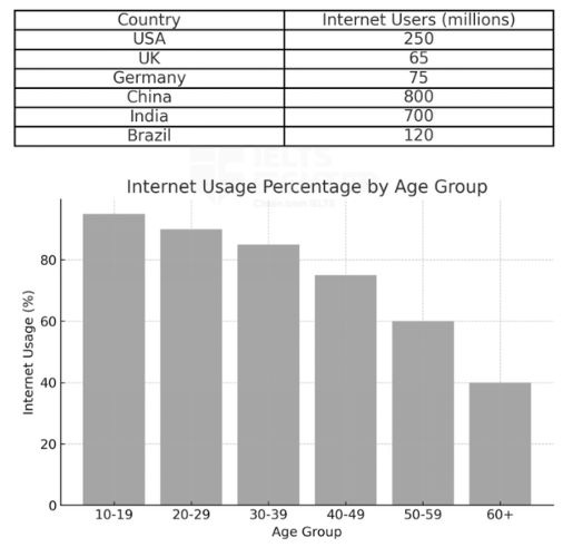
The table shows the number of internet users (in millions) in different countries, while the bar chart illustrates the percentage of internet usage by age group.
Summarise the information by selecting and reporting the main features, and make comparisons where relevant.
1. Outline
Introduction:
The table presents the number of internet users (in millions) across six countries, while the bar chart shows the percentage of internet usage by different age groups.
Bảng số liệu thể hiện số lượng người sử dụng Internet (tính bằng triệu) tại sáu quốc gia, trong khi biểu đồ cột mô tả tỷ lệ sử dụng Internet theo nhóm tuổi.
Overview:
China and India have the largest number of internet users, whereas the UK has the fewest.
Young people (10-19) have the highest internet usage rate, while older individuals (60+) use the internet the least.
Trung Quốc và Ấn Độ có số lượng người dùng Internet lớn nhất, trong khi Anh có số lượng thấp nhất.
Giới trẻ (10-19 tuổi) có tỷ lệ sử dụng Internet cao nhất, trong khi nhóm cao tuổi (60+) sử dụng ít nhất.
Body Paragraph 1:
Describe the large number of internet users in China and India, while highlighting the lower figures in the UK and Germany.
Mô tả số lượng người dùng Internet lớn tại Trung Quốc và Ấn Độ, đồng thời nhấn mạnh con số thấp hơn ở Anh và Đức.
Body Paragraph 2:
Explain the variation in internet usage across different age groups, emphasizing the dominance of younger demographics.
Giải thích sự khác biệt trong tỷ lệ sử dụng Internet giữa các nhóm tuổi, nhấn mạnh mức độ phổ biến của Internet trong giới trẻ.
2. Sample Essay
The table presents the number of internet users (in millions) across six countries, while the bar chart shows the percentage of internet usage by different age groups.
Overall, China and India have the highest number of internet users, whereas the UK has the lowest. Meanwhile, internet usage is most prevalent among young people aged 10-19, while the elderly (60+) exhibit the lowest usage rates.
China leads with 800 million internet users, followed by India with 700 million. The USA has significantly fewer users (250 million), while Germany and Brazil have relatively smaller figures of 75 million and 120 million, respectively. The UK records the lowest number, with only 65 million internet users.
In terms of internet usage by age group, younger individuals dominate. Nearly all teenagers (95%) use the internet, followed closely by the 20-29 and 30-39 age groups at 90% and 85%, respectively. However, usage drops among older age groups, with the 40-49 category at 75%, and only 40% of people aged 60 and above using the internet. These trends indicate that internet access is widespread among younger generations, whereas older people are less engaged with online platforms.
Bảng số liệu thể hiện số lượng người dùng Internet tại sáu quốc gia, trong khi biểu đồ cột mô tả tỷ lệ sử dụng Internet theo nhóm tuổi.
Nhìn chung, Trung Quốc và Ấn Độ có số lượng người dùng Internet cao nhất, trong khi Anh có con số thấp nhất. Đồng thời, Internet phổ biến nhất trong nhóm thanh thiếu niên (10-19 tuổi), trong khi nhóm người cao tuổi (60+) có tỷ lệ sử dụng thấp nhất.
Trung Quốc dẫn đầu với 800 triệu người dùng Internet, tiếp theo là Ấn Độ với 700 triệu. Mỹ có số lượng người dùng thấp hơn đáng kể (250 triệu), trong khi Đức và Brazil lần lượt có 75 triệu và 120 triệu người dùng. Anh ghi nhận số lượng thấp nhất, chỉ 65 triệu.
Về mức độ sử dụng Internet theo độ tuổi, nhóm trẻ chiếm ưu thế. Gần như tất cả thanh thiếu niên (95%) sử dụng Internet, tiếp theo là nhóm 20-29 tuổi (90%) và 30-39 tuổi (85%). Tuy nhiên, tỷ lệ này giảm dần ở các nhóm lớn tuổi hơn, với nhóm 40-49 tuổi ở mức 75% và chỉ 40% số người trên 60 tuổi truy cập Internet. Những xu hướng này cho thấy rằng Internet đã trở thành một phần thiết yếu trong cuộc sống của giới trẻ, trong khi những người lớn tuổi ít tiếp cận hơn với công nghệ này.
3. Uncommon Words and Collocations
- Internet penetration(/ˈɪntərnɛt ˌpɛnɪˈtreɪʃən/, noun phrase): Mức độ thâm nhập của Internet
- Digital engagement(/ˈdɪdʒɪtəl ɪnˈɡeɪdʒmənt/, noun phrase): Mức độ tham gia vào nền tảng số
- Prevalent among(/ˈprɛvələnt əˈmʌŋ/, phrase): Phổ biến trong nhóm
- Online platforms(/ˈɒnlaɪn ˈplætfɔːrmz/, noun phrase): Các nền tảng trực tuyến
- Demographic variation(/ˌdɛməˈɡræfɪk ˌvɛrieɪʃən/, noun phrase): Sự khác biệt giữa các nhóm dân số
Sample 3
Đề bài:
The pie chart shows the percentage of different transportation modes used, while the line graph illustrates the traffic congestion trends in two cities over time.
Summarise the information by selecting and reporting the main features, and make comparisons where relevant.
1. Outline
Introduction:
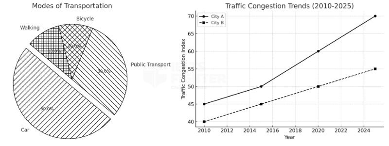
The pie chart presents the proportion of different transportation modes used, while the line graph illustrates the traffic congestion index in two cities (City A and City B) over time.
Biểu đồ tròn thể hiện tỷ lệ sử dụng các phương tiện giao thông khác nhau, trong khi biểu đồ đường mô tả mức độ tắc nghẽn giao thông tại hai thành phố (Thành phố A và Thành phố B) theo thời gian.
Overview:
Cars are the most widely used mode of transport, while bicycles and walking account for the smallest shares.
Traffic congestion has worsened over time in both cities, with City A experiencing a more significant increase.
Ô tô là phương tiện giao thông được sử dụng phổ biến nhất, trong khi xe đạp và đi bộ chiếm tỷ lệ nhỏ nhất.
Tình trạng tắc nghẽn giao thông ngày càng trở nên nghiêm trọng hơn ở cả hai thành phố, trong đó Thành phố A có mức tăng mạnh hơn.
Body Paragraph 1:
Describe the dominance of cars as the primary transportation mode, with public transport being the second most used.
Mô tả sự phổ biến của ô tô như phương tiện giao thông chính, trong khi phương tiện công cộng là lựa chọn thứ hai phổ biến nhất.
Body Paragraph 2:
Explain the steady rise in traffic congestion over time, highlighting the sharper increase in City A compared to City B.
Giải thích xu hướng gia tăng đều đặn của tình trạng tắc nghẽn giao thông theo thời gian, nhấn mạnh sự gia tăng đáng kể hơn ở Thành phố A so với Thành phố B.
2. Sample Essay
The pie chart presents the proportion of different transportation modes used, while the line graph illustrates the traffic congestion index in two cities (City A and City B) over time.
Overall, cars are the most commonly used mode of transport, whereas bicycles and walking have the smallest shares. Traffic congestion has worsened in both cities over time, with City A experiencing a more significant increase.
According to the pie chart, cars account for half of all transportation usage (50%), making them the dominant mode of transport. Public transport is the second most used, with 30% of people relying on buses or trains. In contrast, bicycles and walking each constitute only 10% of total transport usage, indicating a lower preference for these eco-friendly options.
The line graph shows that traffic congestion has steadily increased in both cities since 2010. City A started at an index of 45 in 2010 and rose to 70 in 2025, reflecting a sharp rise in congestion. Meanwhile, City B had a lower congestion level, increasing more gradually from 40 in 2010 to 55 in 2025. These trends suggest that growing car dependency has led to worsening traffic conditions, particularly in City A.
Biểu đồ tròn thể hiện tỷ lệ sử dụng các phương tiện giao thông khác nhau, trong khi biểu đồ đường mô tả mức độ tắc nghẽn giao thông tại hai thành phố theo thời gian.
Nhìn chung, ô tô là phương tiện giao thông được sử dụng phổ biến nhất, trong khi xe đạp và đi bộ có tỷ lệ thấp nhất. Tình trạng tắc nghẽn giao thông ngày càng trầm trọng hơn ở cả hai thành phố, trong đó Thành phố A có mức gia tăng lớn hơn.
Theo biểu đồ tròn, ô tô chiếm một nửa tổng số phương tiện di chuyển (50%), khiến nó trở thành phương tiện giao thông phổ biến nhất. Phương tiện công cộng đứng thứ hai với 30% người dân sử dụng xe buýt hoặc tàu hỏa. Ngược lại, xe đạp và đi bộ chỉ chiếm 10% mỗi loại, cho thấy mức độ ưu tiên thấp hơn dành cho các phương tiện thân thiện với môi trường.
Biểu đồ đường cho thấy tình trạng tắc nghẽn giao thông đã tăng lên đáng kể theo thời gian. Thành phố A bắt đầu với chỉ số 45 vào năm 2010 và tăng lên 70 vào năm 2025, cho thấy sự gia tăng mạnh mẽ về mức độ tắc nghẽn. Trong khi đó, Thành phố B có mức tắc nghẽn thấp hơn, tăng từ 40 vào năm 2010 lên 55 vào năm 2025. Những xu hướng này cho thấy rằng sự phụ thuộc ngày càng lớn vào ô tô có thể là nguyên nhân chính dẫn đến tình trạng giao thông ngày càng xấu đi, đặc biệt là ở Thành phố A.
3. Uncommon Words and Collocations
- Traffic congestion index(/ˈtræfɪk kənˈdʒɛsʃən ˈɪndɛks/, noun phrase): Chỉ số tắc nghẽn giao thông
- Eco-friendly options(/ˌiːkoʊ ˈfrɛndli ˈɒpʃənz/, noun phrase): Các phương án thân thiện với môi trường
- Car dependency(/kɑːr dɪˈpɛndənsi/, noun phrase): Sự phụ thuộc vào ô tô
- Public transport usage(/ˈpʌblɪk ˈtrænspɔːrt ˈjuːsɪdʒ/, noun phrase): Việc sử dụng phương tiện công cộng
- Worsening traffic conditions(/ˈwɜːrsənɪŋ ˈtræfɪk kənˈdɪʃənz/, noun phrase): Điều kiện giao thông ngày càng xấu đi
Sample 4
Đề bài:
The table shows the percentage of workers in different employment sectors, while the pie chart illustrates the gender distribution in the workforce.
Summarise the information by selecting and reporting the main features, and make comparisons where relevant.
1. Outline
Introduction:
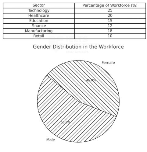
The table presents the proportion of workers in six employment sectors, while the pie chart shows the gender distribution in the workforce.
Bảng số liệu thể hiện tỷ lệ lao động trong sáu lĩnh vực việc làm khác nhau, trong khi biểu đồ tròn mô tả sự phân bố giới tính trong lực lượng lao động.
Overview:
Technology employs the largest percentage of workers, while Retail has the lowest.
Men account for a slightly larger share of the workforce compared to women.
Ngành Công nghệ có tỷ lệ lao động cao nhất, trong khi ngành Bán lẻ có tỷ lệ thấp nhất.
Nam giới chiếm tỷ lệ cao hơn một chút so với nữ giới trong tổng lực lượng lao động.
Body Paragraph 1:
Describe the employment distribution across different sectors, highlighting the dominance of Technology and the lower share of Retail.
Mô tả sự phân bố lao động trong các ngành khác nhau, nhấn mạnh sự chiếm ưu thế của ngành Công nghệ và tỷ lệ thấp hơn của ngành Bán lẻ.
Body Paragraph 2:
Explain the gender distribution in the workforce, emphasizing the slight male majority.
Giải thích sự phân bố giới tính trong lực lượng lao động, nhấn mạnh tỷ lệ nam giới cao hơn một chút so với nữ giới.
2. Sample Essay
The table presents the proportion of workers in six employment sectors, while the pie chart illustrates the gender distribution in the workforce.
Overall, Technology employs the highest percentage of workers, whereas Retail has the lowest. Meanwhile, men constitute a slightly larger share of the workforce than women.
Technology is the leading employment sector, accounting for 25% of all workers, followed by Healthcare at 20%. The Education and Finance sectors have relatively lower shares, making up 15% and 12% of the workforce, respectively. Manufacturing employs 18% of workers, whereas Retail has the smallest proportion at only 10%.
Regarding gender distribution, the workforce is slightly male-dominated, with men representing 55% and women 45%. Although the difference is not substantial, this indicates that men still outnumber women in the labor market. These trends suggest that while employment opportunities are spread across different industries, gender representation remains slightly uneven.
Bảng số liệu thể hiện tỷ lệ lao động trong sáu lĩnh vực việc làm khác nhau, trong khi biểu đồ tròn mô tả sự phân bố giới tính trong lực lượng lao động.
Nhìn chung, ngành Công nghệ có tỷ lệ lao động cao nhất, trong khi ngành Bán lẻ có tỷ lệ thấp nhất. Đồng thời, nam giới chiếm tỷ lệ cao hơn một chút so với nữ giới trong tổng lực lượng lao động.
Ngành Công nghệ đứng đầu với 25% tổng số lao động, tiếp theo là ngành Chăm sóc sức khỏe với 20%. Ngành Giáo dục và Tài chính có tỷ lệ thấp hơn, lần lượt chiếm 15% và 12% lực lượng lao động. Ngành Sản xuất có mức đóng góp 18%, trong khi ngành Bán lẻ có tỷ lệ thấp nhất, chỉ 10%.
Về phân bố giới tính, lực lượng lao động có tỷ lệ nam giới cao hơn một chút, với 55% nam giới so với 45% nữ giới. Mặc dù sự chênh lệch không đáng kể, điều này vẫn cho thấy rằng nam giới chiếm ưu thế hơn trong thị trường lao động. Những xu hướng này cho thấy rằng mặc dù cơ hội việc làm được phân bổ ở nhiều ngành nghề khác nhau, sự đại diện giữa hai giới vẫn chưa hoàn toàn cân bằng.
3. Uncommon Words and Collocations
- Employment distribution(/ɪmˈplɔɪmənt dɪstrɪˈbjuːʃən/, noun phrase): Sự phân bố lao động
- Labor market(/ˈleɪbər ˈmɑːrkɪt/, noun phrase): Thị trường lao động
- Male-dominated workforce(/meɪl ˈdɒmɪneɪtɪd ˈwɜːrkfɔːrs/, noun phrase): Lực lượng lao động do nam giới chiếm ưu thế
- Industry representation(/ˈɪndəstri ˌrɛprɪzɛnˈteɪʃən/, noun phrase): Sự đại diện trong ngành nghề
- Workforce participation (/ˈwɜːrkfɔːrs pɑːrˌtɪsɪˈpeɪʃən/, noun phrase): Sự tham gia của lực lượng lao động
Trên đây là một số bài mẫu IELTS Writing Task 1 Mixed Chart, cả nhà cùng tham khảo thêm bài mẫu hay nữa: